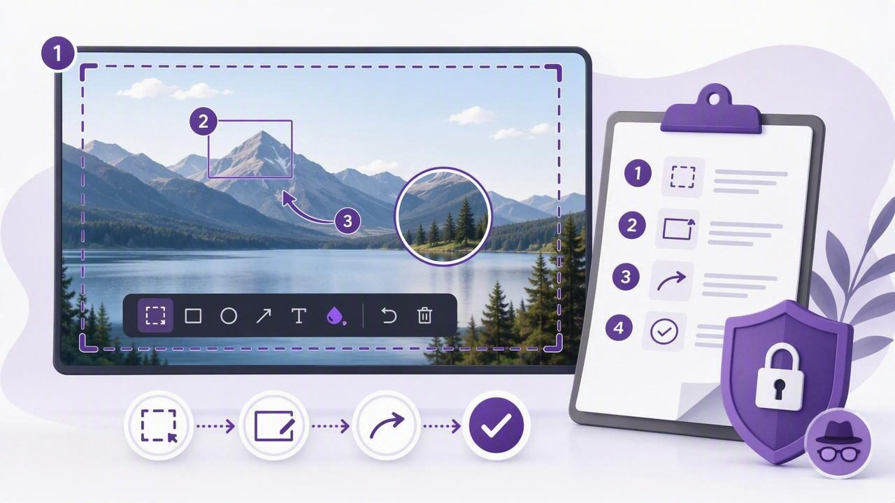
A well-made tutorial should help someone complete a task without guessing where to click, what to type, or what result to expect. Written instructions matter, but screenshots often make the difference between a guide that feels simple and one that creates support requests.
Using a full screen capture tool gives you a fast way to document an entire workflow, from opening an app to verifying the final result. When you combine full-screen captures with focused region screenshots, arrows, blur effects, and numbered step markers, you can create tutorials that are easier to scan and follow.
This checklist explains how to plan, capture, annotate, review, and share a step-by-step visual tutorial on a Mac. It works for software onboarding, internal documentation, customer help centers, product walkthroughs, bug reproduction steps, and client feedback.
Why Use a Full Screen Capture Tool for Tutorials?
A full-screen screenshot provides useful context. It shows the application window, visible menus, sidebars, browser tabs, and other interface elements that may help readers understand where they are in a workflow. This is particularly helpful when a task begins with navigation rather than a single isolated button.
However, a full display image can also include distractions. The best tutorial workflow is usually not to choose only full-screen or only region capture. Instead, use each format intentionally:
- Use full-screen capture when readers need orientation or need to see an entire interface state.
- Use region capture when a specific dialog, setting, form field, or menu is the focus.
- Use annotations to eliminate ambiguity and direct attention to the right control.
- Use numbered markers when a sequence contains several actions in one screen.
For example, a tutorial about changing a browser privacy setting may begin with a full-screen capture of the browser. The next image could be a smaller crop of the settings menu, followed by a close-up of the exact checkbox the reader needs to enable.
Before You Capture: Plan the Tutorial
Capturing screenshots before planning can lead to inconsistent images, missing steps, and unnecessary recaptures. Spend a few minutes defining the task before opening your screenshot tool.
1. Define one clear outcome
Every tutorial should answer one primary question. Avoid combining unrelated tasks in the same guide. A focused objective makes it easier to decide what each screenshot must show.
Good outcomes include:
- Connect a calendar account to a desktop app.
- Export a report as a PDF.
- Invite a teammate to a project workspace.
- Turn on a specific notification preference.
A vague objective such as “learn the dashboard” usually needs to be broken into several shorter tutorials.
2. Write the action sequence first
Perform the task once without taking screenshots and write down every meaningful action. This gives you a reliable script and reveals whether there are decision points, confirmation messages, or prerequisites that users need to know.
1. Open Settings
2. Select Notifications
3. Choose Email Alerts
4. Enable Weekly Summary
5. Click Save
6. Confirm the success message
Include the final confirmation state whenever possible. A tutorial is more reassuring when the reader can compare their result with an expected success message, updated status, or completed screen.
3. Prepare a clean screen
Before beginning your screenshot checklist, close unrelated apps and browser tabs. Remove temporary notes, private messages, and personal files from view. Use a test account when documenting a product with customer data, billing details, or sensitive project information.
Clean screenshots look more professional, but this step is also important for privacy. A full-screen capture can reveal more than you intended, including names in notifications, bookmarks, open documents, or account details in a menu bar.
Step-by-Step Tutorial Checklist
Use the following process each time you create a visual guide with a full screen capture tool.
- Start from the reader’s starting point. Capture the screen where a new user would realistically begin. Do not assume they already have the correct menu or page open.
- Capture the full display for orientation. Take a full-screen image when the overall app layout, navigation area, or desktop context matters.
- Switch to region capture for precision. Select only the dialog box or interface section that contains the next action. This reduces visual noise.
- Add a numbered step marker. Place a “1,” “2,” or “3” beside each control in the order the reader should use it.
- Use arrows for direction. Add an arrow when a numbered marker alone does not clearly identify the target. Keep arrows short and avoid crossing them.
- Add brief text labels only when necessary. A label such as “Choose Advanced” can clarify a small icon or an unfamiliar symbol. Avoid repeating the paragraph text inside the image.
- Blur private or irrelevant information. Blur names, email addresses, account numbers, customer records, API keys, and unnecessary browser content before exporting.
- Write one action per written step. Use direct, active language: “Click Save,” “Select Export,” or “Enter your workspace name.”
- Show the result. Include a final capture that confirms the task was completed successfully.
- Review the guide as a first-time user. Check whether every image and instruction still makes sense without your background knowledge.
How to Annotate Screenshots Without Overloading Them
Screenshot annotation should make the next action obvious, not turn every image into a diagram. A common mistake is adding too many colors, callouts, arrows, and text boxes. Readers then spend time decoding the annotation instead of completing the task.
Use a simple visual system throughout the tutorial:
| Annotation | Best use | Practical guideline |
|---|---|---|
| Numbered marker | Ordered clicks or fields | Use one sequence style from start to finish. |
| Arrow | Pointing to a target | Use when the target is small or visually crowded. |
| Rectangle or outline | Highlighting an area | Outline groups of controls rather than every individual item. |
| Text label | Clarifying icons or choices | Keep labels short and readable at normal size. |
| Blur | Protecting sensitive content | Blur before copying, saving, or sharing the image. |
Consistency is more valuable than decoration. If you use red arrows in one image and blue arrows in the next, readers may wonder whether the color carries meaning. Unless color is part of your documented interface, choose one or two annotation colors and use them consistently.
Example: Turning a Full-Screen Capture Into a Clear Guide
Imagine you are documenting how to change an account setting in a web application. A basic full-screen screenshot may show the entire browser, but the account menu is small and easy to miss. Instead of writing a long paragraph explaining its location, build the tutorial in layers.
- Take a full-screen capture of the dashboard and add an arrow pointing to the profile icon.
- After opening the menu, capture only the menu area and place a numbered marker beside “Settings.”
- Capture the settings page and outline the relevant category in the sidebar.
- Use a close region capture for the final toggle, dropdown, or form field.
- Capture the confirmation banner or updated setting to show success.
This sequence gives readers context first, then progressively narrows their attention. It also keeps each screenshot useful at the size where it will appear in a help article, knowledge base, or shared document.
Privacy Checks Before You Export or Share
A screenshot is a record of what was visible at a specific moment. Before you copy an image into a ticket, save it to a project folder, or attach it to an email, inspect it carefully.
- Check for names, addresses, phone numbers, and email addresses.
- Hide passwords, one-time codes, API tokens, and secret keys.
- Blur customer information, payment details, and internal project data.
- Look at browser tabs, bookmarks, desktop files, and notifications.
- Confirm that test data cannot be mistaken for real customer information.
This matters especially for bug reports and client feedback. A screenshot may make an issue easier to reproduce, but the image should reveal only the information required to explain the problem. Local-first screenshot workflows can be useful here because captures remain on your device unless you deliberately copy, save, or share them.
Choose an Export Method That Matches the Next Task
The final step in a screenshot workflow is not always saving a file. Think about where the tutorial will go next. For a quick team message, copying the annotated image directly into chat may be fastest. For documentation, saving a clearly named file can make future updates easier. For design review or client feedback, dragging the image into the relevant app may reduce friction.
Use descriptive filenames if you save images:
step-01-open-settings.png
step-02-select-notifications.png
step-03-enable-weekly-summary.png
A predictable naming pattern makes screenshots easier to sort, replace, and reuse when an interface changes.
Final Review: Can Someone Follow It Without Asking Questions?
Before publishing, give the tutorial one final read-through. Check that the written steps match the screenshots exactly, that numbered markers appear in the right order, and that every control is visible at a readable size. If possible, ask someone unfamiliar with the workflow to test it.
The best tutorial screenshot does not merely show what happened. It makes the next action unmistakable.
A capable full screen capture tool, paired with focused cropping and restrained annotation, can turn routine instructions into clear visual guidance. If you want a lightweight Mac workflow built around local captures, editable annotations, and optional sharing, Snip Halo is one option to consider after defining the features that matter most to your documentation process.
