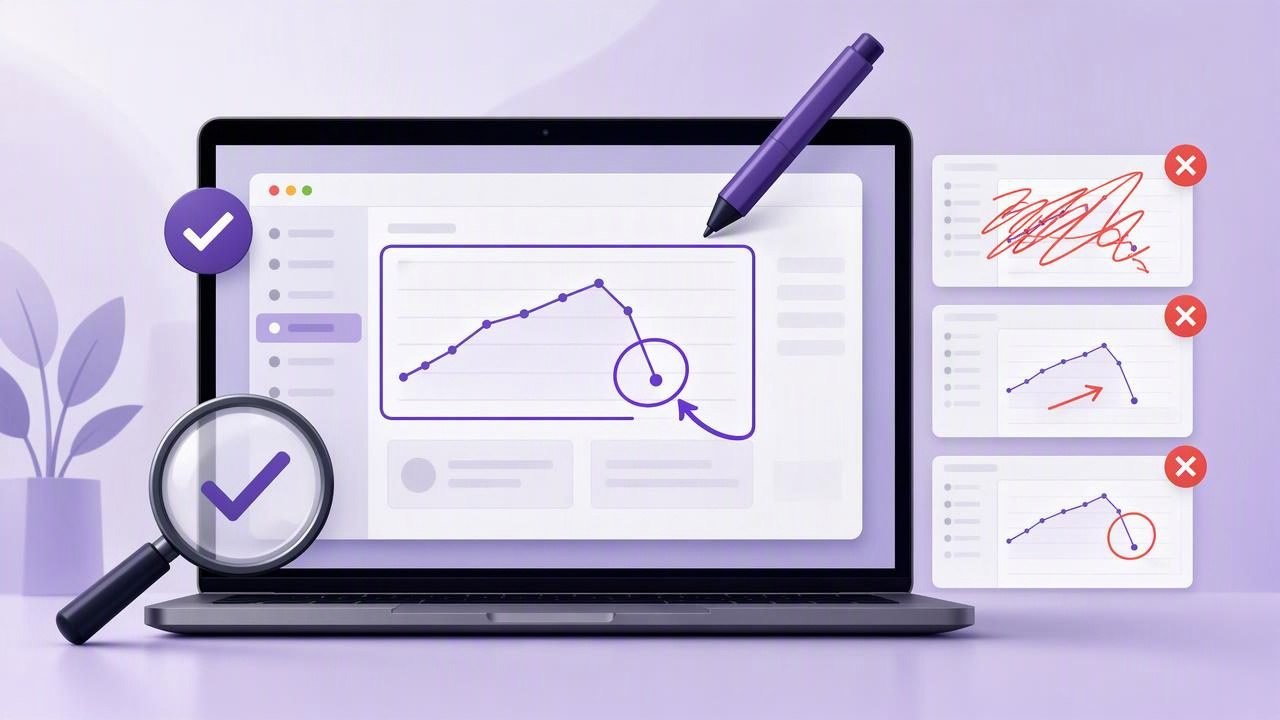
A screenshot can explain an issue, answer a question, or guide someone through a task faster than a long message. But screenshots are only useful when the important information is easy to find. A cluttered image, vague arrow, unreadable label, or poorly placed blur effect can create more confusion than it removes.
Whether you create bug reports, software tutorials, client feedback, internal documentation, or customer support replies, avoiding common screenshot annotation tool mistakes to avoid will make your visual communication more useful. The goal is not to decorate an image. The goal is to help the viewer understand what matters, what action to take, and what happens next.
This guide covers the most frequent screenshot annotation mistakes, why they weaken your message, and how to build a practical annotation workflow on a Mac.
1. Capturing Too Much of the Screen
One of the most common mistakes happens before annotation begins: capturing an entire display when only a small region is relevant. Full-screen capture has a purpose, especially when context matters, but it can make a tiny interface issue difficult to see.
For example, if you are reporting that a button label is clipped, a 5K full-display screenshot forces the recipient to search for the problem. A focused region capture brings attention directly to the faulty element.
How to choose between region and full-screen capture
- Use region capture for interface bugs, individual settings, form fields, tooltips, and visual feedback on a specific page area.
- Use full-screen capture when showing a multi-window workflow, display-level issue, desktop layout, or the relationship between applications.
- Include modest context around the target so the viewer understands where it appears in the interface.
A useful rule is to capture the smallest area that still answers the viewer’s likely question: Where is this, and what should I notice?
2. Using Too Many Arrows, Shapes, and Colors
Annotation tools make it easy to add arrows, boxes, circles, text, and highlights. That convenience can lead to over-annotation. When every area has a bright box, thick arrow, and label, nothing has visual priority.
Instead, treat annotations as a hierarchy. Use one primary marker for the most important action or problem, then use secondary markers only where they add necessary detail. An arrow may be enough for a simple “click here” instruction. A numbered step marker is better when users must complete several actions in a fixed order.
Keep your annotation system consistent
| Annotation | Best use | Common mistake |
|---|---|---|
| Arrow | Pointing to a single target | Using several arrows that cross each other |
| Rectangle or circle | Framing a control or area | Making outlines so thick they cover the interface |
| Text label | Adding essential explanation | Writing full paragraphs inside the image |
| Blur | Hiding sensitive content | Blurring the item the viewer needs to inspect |
| Numbered marker | Showing sequence | Numbering steps that can be performed in any order |
Use a limited palette, preferably one main color and one secondary color for warnings or exceptions. Consistency makes screenshots easier to scan across an entire tutorial or bug report.
3. Writing Labels That Repeat the Obvious
Text annotations should clarify meaning, not narrate every visible detail. Labels such as “Button,” “Menu,” or “Click this button” offer little value when an arrow already points to the control. They consume space and distract from the actual instruction.
Better labels explain intent or expected behavior. For example:
- Weak: “Save button”
- Better: “Select Save to apply the new export settings.”
- Weak: “Error”
- Better: “Validation message appears after entering an invalid account ID.”
Keep labels short enough to read at a glance. If you need multiple sentences to explain a screenshot, place the detail in the surrounding document, ticket, or email rather than filling the image with text.
4. Ignoring Readability at the Final Size
An annotation can look perfect in an editor but become unreadable after it is pasted into Slack, attached to an issue tracker, added to a knowledge base, or viewed on a phone. Small type, faint colors, and thin lines are especially vulnerable to resizing and compression.
Before sending an image, inspect it at approximately the size your audience will see. Make sure text remains legible, arrows still have visible endpoints, and numbered step markers are large enough to distinguish.
Simple readability checks
- Zoom out until the screenshot is roughly the size it will appear in the destination.
- Ask whether the target can be found in two seconds.
- Check contrast between the annotation color and the underlying interface.
- Make sure labels do not overlap controls, error messages, or other important details.
- Export or copy the image once, then confirm compression has not obscured the point.
High contrast is usually more useful than stylish colors. A bright arrow on a light interface may disappear, while a dark outline with a clear fill remains visible.
5. Blurring Sensitive Information Incompletely
Privacy errors are among the most serious screenshot annotation tool mistakes to avoid. Screenshots may include email addresses, customer names, account numbers, API keys, internal URLs, browser tabs, notifications, calendar items, and direct messages. Even a small overlooked detail can expose information you did not intend to share.
Blur should be deliberate, not rushed. Review the entire frame, including the menu bar, browser chrome, sidebar, dock, notification area, and neighboring windows. When documenting a workflow, use realistic dummy data whenever possible instead of relying solely on redaction.
Before sharing a screenshot externally, review it as if you were seeing it for the first time. Sensitive details often live outside the area you were focused on.
Also remember that a visual blur should fully obscure text. If characters, account balances, or tokens can still be inferred, crop the section out or replace it with approved sample data.
6. Failing to Show the Sequence of Actions
A screenshot can show what to click, but a tutorial often needs to show when to click it. This is where numbered step markers are more effective than a collection of unrelated arrows.
Use numbers when the order changes the result. For instance, a user may need to open a menu, choose a preferences item, enable a setting, and then restart an application. A single image with numbered markers can make that sequence immediately clear.
Do not force every workflow into one dense image, however. If the user must navigate through different screens, create a short series of screenshots. Each image should communicate one stage of the process.
Screenshot 1: Open Settings
Screenshot 2: Select Notifications
Screenshot 3: Enable the required option
Screenshot 4: Confirm the expected result
This structure is easier to maintain than one overloaded screenshot covered with tiny callouts.
7. Leaving Out the Expected Result in Bug Reports
Developers and QA teams need more than a red box around a defect. An effective visual bug report identifies the location of the problem and explains the difference between expected and actual behavior.
Pair the annotated screenshot with concise context:
- Environment: device, macOS version, browser, or app build.
- Steps to reproduce: the minimum actions needed to trigger the issue.
- Actual result: what appears in the screenshot.
- Expected result: what should happen instead.
For example, an arrow can point to a disabled checkout button, while the written report explains that the button should activate after valid shipping information is entered. The screenshot supplies evidence; the text supplies the interpretation.
8. Creating a Different Visual Style Every Time
Inconsistent annotations make documentation feel harder to follow. If one screenshot uses red arrows, another uses yellow circles, and a third uses labels in several font sizes, readers must repeatedly learn a new visual language.
Create a lightweight style guide for your team or personal documentation. Define preferred colors, arrow thickness, text size, shape usage, and the meaning of numbered steps. You do not need a complex brand system. A few repeatable choices are enough.
Consistency is particularly valuable for customer-facing tutorials, onboarding documents, and recurring visual feedback cycles. It helps readers recognize the action cues without stopping to interpret the annotation style.
9. Treating Sharing and Storage as an Afterthought
Your screenshot workflow should fit the sensitivity and destination of the image. Copying directly into a message is fast for short-lived internal feedback. Saving a file is useful for documentation and formal bug reports. Dragging an image into another app can reduce export friction.
For confidential work, understand where screenshots are stored and whether they are uploaded automatically. A local-first workflow keeps captures and recent history on your Mac unless you choose to share them. If cloud sharing is needed, use an account and destination you control, and confirm who can access the file.
The best workflow is not always the one with the most integrations. It is the one that lets you move quickly without losing control of sensitive visual information.
A Better Screenshot Annotation Workflow
Clear screenshots come from a repeatable process rather than more effects. Start by deciding what the reader must notice. Capture only the necessary context, add the minimum number of annotations, confirm readability, and review privacy before sharing.
- Define the single purpose of the screenshot.
- Choose region capture or full-screen capture based on context.
- Add one primary annotation and only essential secondary details.
- Use numbered markers for ordered actions.
- Verify text, contrast, and blur at final viewing size.
- Pair the image with concise written context when needed.
- Choose a sharing method appropriate for the image’s sensitivity.
For Mac users who want a focused, local-first approach to region capture, full-screen capture, arrows, blur, text, and step markers, Snip Halo is one example of a lightweight tool designed around this practical workflow.
By avoiding these screenshot annotation mistakes, your images become faster to understand, easier to act on, and more reliable in every tutorial, bug report, and feedback conversation.
