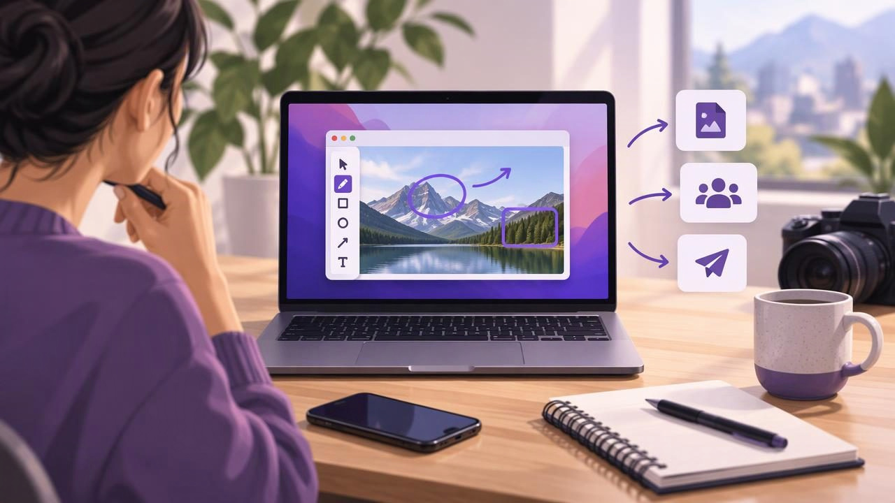
A screenshot can do more than show what is on a screen. For content creators, it can explain a setting, illustrate a tutorial, highlight a design issue, or make a review easier to follow. The difference between a useful image and a confusing one often comes down to how it is captured and annotated.
A good screenshot annotation tool for content creators should help you make the important detail obvious without turning every image into a design project. With a simple workflow for capturing, marking up, and sharing screenshots on Mac, you can make visual content clearer and reduce the time spent correcting misunderstandings.
Why creators need a repeatable screenshot workflow
Creators use screenshots in many formats: software tutorials, newsletter walkthroughs, product comparisons, support replies, course materials, and social posts. Each has a different audience, but the goal is similar: help someone understand what they are looking at and what to do next.
Without a consistent process, screenshots can become cluttered or incomplete. A full desktop may expose unrelated windows. A tiny crop may leave out the context that explains the feature. Too many arrows or labels can compete with the interface itself. These issues create friction for readers and may lead to follow-up questions.
A repeatable workflow helps you make deliberate choices. Decide what the viewer needs to see, capture only the useful area, and use a small number of annotations to guide attention. That approach is faster than trying to rescue an unclear image later.
Start with the right capture: region or full screen
Choose the capture size based on the story the screenshot needs to tell. Region capture is usually best when you are explaining one control, menu, chart, or section of a page. It removes unrelated visual noise and gives the subject more space in the final image.
A full-screen capture is more useful when context matters: for example, when showing how a window relates to a menu bar, comparing an entire dashboard, or documenting a layout problem. Before capturing, close unrelated windows and move the pointer away from any text or control that should remain visible.
Check the image at the size your audience will see it. A detail that looks readable on a large Mac display may become too small in a mobile newsletter or a compact help article. If the important text is hard to read, capture a closer region or provide a second, wider screenshot for context.
Use annotations to create visual hierarchy
Annotation is not decoration; it is a way to direct attention. Begin by identifying the one point a viewer should notice first. Then add the minimum markup needed to make that point clear. One clear arrow often works better than several labels, circles, and highlights competing for attention.
- Arrows: Point to a specific button, field, or location. Keep the arrowhead close to the target without covering it.
- Shapes: Use a rectangle or circle to frame an area. Leave enough space around the control so the outline does not obscure its boundaries.
- Text: Add a short label when the image needs context, such as ‘Select Export’ or ‘Updated setting.’ Keep instructions concise.
- Blur: Hide personal details, customer information, or credentials that are not necessary to the explanation.
- Numbered markers: Show the order of actions in a multi-step walkthrough. Use numbers consistently and pair them with concise instructions.
Use a limited color palette and consistent marker sizes across a tutorial or series. Strong contrast helps annotations remain visible, but highly saturated colors can overpower the interface. If an outline crosses text or a control, reposition it or choose a different shape rather than relying on the reader to infer what is underneath.
Make numbered screenshots easier to follow
Numbered steps work especially well for tutorials, onboarding, and troubleshooting. Place each marker beside the action it describes, then make sure the sequence follows the same order as the written instructions. If a screenshot contains more than a few steps, consider splitting it into two images instead of crowding everything into one.
For a clear sequence, use an action verb and one outcome per step. For example: ‘1. Open Preferences,’ ‘2. Choose Accounts,’ and ‘3. Turn on notifications.’ This is easier to scan than a paragraph written directly over the interface. When the sequence crosses multiple screens, label each screenshot or include a brief caption so readers know when to move on.
Check that the numbers remain legible at the final display size. Small markers can disappear when an image is resized, while oversized badges can conceal the interface. Consistency matters more than a particular style: keep the same position, shape, and color for each marker.
Match the markup to the creator task
The best annotation style depends on what you are making. A product review may need one arrow to identify a feature. A software tutorial may need several numbered steps. Bug reports benefit from a focused capture, a marker around the problem, and a short note describing what happened.
| Creator task | Useful screenshot approach |
|---|---|
| Software tutorial | Capture the relevant area and add numbered steps in order. |
| Product review | Highlight the feature being discussed and add a short label if needed. |
| Bug report | Show the issue with enough surrounding context to reproduce it. |
| Client or team feedback | Point to the exact area and state the requested change briefly. |
| Privacy-sensitive example | Blur identifying details before saving or sharing the image. |
For bug reports, include the visible result rather than only marking where you clicked. A useful image can show the unexpected message, the affected control, and enough of the window to establish context. Add written details such as the expected behavior and steps to reproduce separately, so the screenshot supports the report instead of carrying all of it.
Protect privacy before you share
Screenshot privacy deserves attention because images can contain details that are easy to overlook: email addresses, account names, browser tabs, customer records, or notifications. Scan the entire capture before sharing, not just the area you annotated. Blur information that is not required, and recapture the image if sensitive content cannot be hidden cleanly.
Also consider where screenshots are stored. Some workflows automatically upload images or keep them in a cloud history. Others keep captures local unless you choose to share them. If you handle customer or client information, understand the app’s storage and sharing behavior before making it part of your routine. Local-first storage can reduce unnecessary transfers, while an explicit sharing step gives you more control over what leaves your Mac.
Export and share without losing clarity
After annotation, choose a format and destination that suit the work. Copying an image is convenient for a chat or document. Saving a file is better when you need a reusable asset for a course, article, or design review. Dragging a capture into another app can also keep a quick feedback workflow moving.
Use a descriptive filename when you save screenshots for later, such as checkout-error-payment-step rather than Screenshot 12. For a group of tutorial images, use a shared prefix and step number so the files stay in order. If you use cloud storage, check that the intended folder and permissions are correct before sending a link. A screenshot link should be as deliberate as an email attachment.
Keep the original capture if you expect to revise annotations later. Otherwise, save a clean final version and avoid creating multiple files with vague names. A small amount of organization prevents the common problem of publishing an outdated screenshot or sending the wrong markup to a client.
A quick quality check before publishing
- Does the capture show the detail and context the viewer needs?
- Can someone identify the main point within a few seconds?
- Are arrows, labels, shapes, and numbers readable without covering important content?
- Have you removed or blurred private information?
- Does the saved or shared version match the final instructions?
Review the image at its expected size and, when possible, in the page or message where it will appear. That final check catches problems that are easy to miss while editing, such as small text, weak contrast, or an annotation that points between two controls.
Choose a tool that fits the way you work
When comparing Mac screenshot apps, look beyond the number of features. Consider how quickly you can capture a region, whether the annotation tools are easy to understand, how you copy or save finished images, and whether storage behavior matches your privacy needs. A creator who mainly publishes tutorials may value numbered steps; someone sending frequent bug reports may care more about fast markup and clear context.
Pricing and complexity matter too. A subscription can make sense for a larger workflow with advanced collaboration or asset management. If you need straightforward capture and annotation, a focused app with a one-time price may be a better fit. The right choice is the one that supports your real tasks without adding steps you will not use.
For Mac creators who want a focused, local-first workflow with optional Google Drive sharing, Snip Halo is one option to consider. Whichever tool you choose, the strongest results come from the same habits: capture intentionally, annotate sparingly, protect private details, and make the next action obvious.
