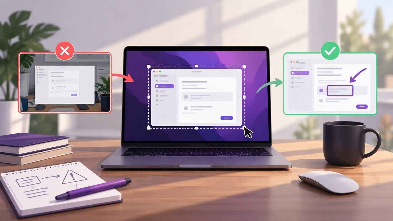
A region capture app can turn a confusing screen into a clear bug report, tutorial, or piece of visual feedback. But capturing only part of your display does not automatically make a screenshot useful. A crop that hides context, annotations that compete for attention, or a sharing step that exposes private information can make even a polished image harder to act on.
Whether you are documenting a software issue, explaining a process, or reviewing a design, a few deliberate choices make a big difference. Here are the most common region capture app mistakes to avoid on Mac, along with a practical workflow for creating clearer and safer screenshots.
1. Capturing too tightly—or too broadly
The crop sets the context for everything that follows. A selection that is too tight may show the button or error but omit the window, page title, or surrounding controls that help someone understand where it appeared. A selection that is too broad can bury the important detail in empty space and unrelated interface elements.
Before capturing, ask what the recipient needs to know. For a misplaced icon, include enough of the toolbar to identify its location. For a full-page layout issue, a region around one small component may not show the spacing problem. The goal is not the smallest possible screenshot; it is the smallest screenshot that preserves the necessary context.
- Include nearby labels or controls when they help explain the issue.
- Leave a modest margin around the subject so annotations do not feel cramped.
- Exclude unrelated windows, desktop clutter, and personal information.
2. Forgetting when full-screen capture is the better choice
Region capture is useful for focus, but it is not right for every task. If the issue depends on the relationship between several windows, a full-screen capture may explain more than a tightly selected crop. The same applies when documenting a menu that opens in a different part of the screen or demonstrating an interaction across apps.
Choose the capture type based on the story you need the image to tell. Use a region for a focused control, error message, or design detail. Use full-screen capture when layout, window placement, or a multi-step desktop setup is part of the problem. If you are unsure, consider capturing a focused region first and expanding the frame only if it removes useful context.
3. Leaving out the state that caused the problem
A screenshot records one moment. It may not reveal what happened immediately before that moment, which account was active, or which settings were selected. When the state matters, capture the relevant evidence instead of expecting the viewer to infer it.
For a bug report, include the visible error and any essential context, such as the selected tab or form field. Add a short note in the report describing the action that led to the result. A screenshot supports that description; it does not replace it. Avoid trying to fit a full incident history into the image, where tiny text can become unreadable.
4. Using annotations without a clear visual hierarchy
Arrows, shapes, and text can direct attention, but each mark should have a purpose. Too many colors, oversized shapes, and overlapping labels make a screenshot feel busy. If every element is emphasized, the viewer has no clear signal about what matters most.
Start with one primary annotation. Add an arrow to point to a specific detail, a rectangle to outline an area, or a short text label to clarify what the viewer should notice. Keep annotation styles consistent across a set of screenshots. For example, use one color for highlights and another only when you need to distinguish a warning or secondary detail.
- Use arrows for direction, not decoration.
- Use shapes to frame a control or area without covering it.
- Keep labels brief and place them where they do not obscure the interface.
5. Making arrows and shapes hard to interpret
An arrow that points between two controls can leave the reader guessing. A shape that covers the label it is meant to highlight defeats its purpose. Place the arrowhead close to the exact target and keep the line clear of important text. If several items need attention, use separate, intentional marks rather than one tangled annotation.
Also check that your markings remain visible against the background. A pale line on a white settings panel or a dark label over a busy image can disappear. Choose a high-contrast style, then inspect the final screenshot at the size someone will actually view it. A mark that looks clear while editing may become faint when pasted into a chat or ticket.
6. Skipping numbered steps in a multi-part explanation
When a screenshot supports a sequence of instructions, numbered step markers can make the order much easier to follow. Without them, readers may not know whether to start at the top, follow arrows, or interpret annotations in another order. But numbers only help if they match the written instructions.
Keep each marker near the relevant control without covering it. Use the same numbering in the image and the accompanying steps, and avoid placing two markers so close together that their order is unclear. If the process involves many actions, use multiple screenshots rather than squeezing every step into one crowded image.
7. Blurring too little—or blurring so much that context disappears
Blur can conceal personal or confidential details, such as email addresses, account identifiers, or customer information. Missing one visible detail can create a privacy problem, but blurring broad sections can also remove context needed to understand the issue. Review the entire capture, not just the obvious focal point.
Look for names in sidebars, browser tabs, notifications, profile menus, and background windows. Blur only what should not be shared, and make sure the sensitive text cannot still be read around the blurred area. When possible, close unrelated content before capturing. Removing sensitive material at the source can be clearer than covering a large portion of the screenshot afterward.
8. Capturing before the interface is ready
Timing matters. A screenshot taken while a menu is still opening, a page is loading, or a tooltip covers a control may fail to show the intended state. Notifications can also appear at exactly the wrong moment. Before capturing, wait for the interface to settle and confirm that the relevant content is visible.
For repeatable tutorials or bug documentation, recreate the same state before each capture. That consistency makes images easier to compare and reduces distracting differences. If an issue appears intermittently, note that in the accompanying report rather than presenting one screenshot as proof of every occurrence.
9. Saving or sharing without checking the final image
Copying, saving, dragging, and sharing all move a screenshot into a new context. A crop that looked crisp in the editor may be difficult to read after being resized in a document or messaging app. Before sending, check the actual output and confirm the image includes the complete selection, readable text, and intended annotations.
Choose a useful filename if you are saving a series, such as a topic and sequence number. For a support ticket, include a short explanation of what the image shows. When sharing through a cloud service, verify the destination and access settings; do not assume a link is private simply because the screenshot began on your Mac.
10. Ignoring how the screenshot app handles privacy
Screenshots can contain more information than you intend to share. Consider not only the marked-up image, but also where captures are stored, whether recent history remains available, and whether the app uploads anything automatically. These details matter when working with client designs, internal tools, or personal accounts.
Look for a workflow that makes storage and sharing understandable. Local-first behavior means captures stay on your device by default, while optional cloud sharing can be chosen when needed. Review an app's settings and privacy information rather than assuming every screenshot tool works the same way. If you use a connected service, check which account receives the file and who can access it.
A practical Mac region capture checklist
Before sending a screenshot, take a moment to run through this checklist:
- Frame: Does the crop include enough context without unnecessary clutter?
- State: Is the relevant interface visible and stable?
- Focus: Is the main point immediately obvious?
- Annotations: Do arrows, shapes, text, or numbered markers clarify rather than distract?
- Privacy: Have you removed or blurred sensitive information?
- Output: Is the saved, copied, or shared image readable in its destination?
Choose a workflow that fits the task
The best region capture workflow is not necessarily the one with the most editing features. It is the one that lets you capture the right area, explain it clearly, and deliver it safely without extra friction. A simple annotated crop may be ideal for a quick support reply. A tutorial may need numbered steps and several consistent images. A design review may benefit from a full-screen view alongside close-ups of important details.
When comparing Mac screenshot apps, consider capture options, annotation tools, privacy defaults, sharing choices, and pricing together. Some workflows prioritize broad recording or cloud features; others focus on quick captures and markup. A focused app such as Snip Halo is one option for region or full-display capture, annotation, and local-first handling with optional Google Drive sharing. Whatever you choose, careful framing and a final review are what turn a screenshot into useful communication.
