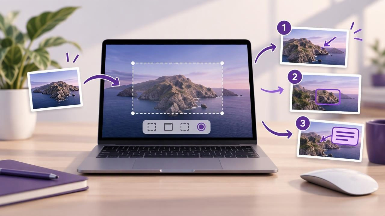
Numbered screenshots make instructions easier to follow. Instead of describing a sequence in a long paragraph, you can mark each action directly on the image: click the menu, choose a setting, then save. This simple technique helps readers understand tutorials, bug reports, and design feedback at a glance.
If you are new to screenshot annotation, it is easy to add too much detail or place markers where they obscure the interface. These numbered screenshot maker tips for beginners will help you create images that are clear, consistent, and useful. You will learn how to plan a capture, position step markers, choose supporting annotations, and share the result responsibly on Mac.
1. Decide what the screenshot needs to explain
Before capturing anything, define the task the image should make easier. Are you showing someone where to click, documenting a software problem, or comparing a design before and after a change? A clear purpose determines what belongs in the frame and which annotations will help.
For a short tutorial, one screenshot might show three actions in sequence. For a bug report, the most useful image may be a single screen with one numbered marker pointing to the unexpected result. Avoid adding steps simply because your screenshot tool makes numbering easy. Every marker should answer a reader’s question.
2. Choose region capture or full-screen capture
Capture only the area that gives the reader enough context. A region capture is useful for a dialog, toolbar, or small interface detail. It can remove unrelated windows and desktop clutter, making the important controls easier to see. A full-screen capture is better when the location of an item matters, or when you need to show how several parts of an application relate to one another.
Give the image a quick review before annotating it. Check that the relevant text is readable, the cursor is not covering a control, and no notification is hiding important information. If the screenshot feels cramped, recapture a slightly larger region rather than shrinking the annotations to fit.
3. Arrange steps in a natural reading order
Number markers should follow the order in which a person performs the task. On a typical left-to-right interface, readers often scan from left to right and from top to bottom. Use that pattern when it matches the actual workflow. If the interface requires a different sequence, make the order unmistakable by placing each number beside the control it describes.
Keep the sequence short where possible. A screenshot with twelve markers can turn into a visual puzzle, especially on a small screen. If a process has many actions, divide it into multiple images or separate sections. A few readable steps are more useful than a crowded picture that tries to explain everything at once.
4. Place numbers beside controls, not on top of them
A marker needs to be close enough to identify its target, but it should not cover the button, label, or result the reader needs to see. Place numbered circles in nearby empty space and use a short arrow when the relationship is not obvious. Check each marker at normal viewing size, not just while zoomed in inside an editor.
Use consistent spacing and alignment. If several numbers sit along one edge, line them up where practical. Avoid letting markers overlap one another or collide with interface text. When there is no clear space, consider widening the capture or using a smaller but still legible marker rather than stacking annotations over the content.
5. Make numbering easy to distinguish
Numbers need enough contrast to stand out from both the interface and the screenshot background. A solid circle with a clearly readable numeral is a familiar choice. Keep the marker style consistent throughout the image: use the same general size, color, and shape for each step.
Color can help, but do not rely on color alone to communicate order. The numerals themselves should remain readable for people who have difficulty distinguishing certain colors, and when an image is printed in grayscale. If you use more than one color to indicate categories, add a plain-language explanation too.
6. Add only the annotations that improve understanding
Numbered markers can work alongside arrows, shapes, and text, but each annotation should have a clear job. Use an arrow to point precisely to a control. Use a rectangle or circle to highlight an area. Add a brief text label if a number alone does not explain what happens next.
For example, a setup instruction might use a number beside a menu, an arrow toward a setting, and a short label such as Select Preferences. Avoid using several arrows to point at the same object or adding labels that repeat what the interface already says. The goal is to direct attention, not decorate the screenshot.
7. Keep labels short and specific
Text annotations work best as compact instructions or explanations. Phrases such as Open Settings or Confirm the status are easier to scan than a full paragraph placed over the image. Put longer explanations in the message or document accompanying the screenshot, where they can be read without covering the interface.
Choose plain language and use the same terms that appear in the application. If you are reporting a problem, describe what the reader should notice rather than guessing at the cause. For instance, identify a button that does not respond instead of claiming that a particular software component is broken without evidence.
8. Blur private information before sharing
Screenshots can reveal more than the intended instructions: names, email addresses, account details, messages, or file paths may be visible in the background. Review the entire capture before sending it, including open menus and window edges. Use a blur or other suitable redaction tool to conceal information that is not needed for the task.
Do not assume that cropping alone removes every sensitive detail. Look for identifying information throughout the final image, then inspect the saved or copied version. For confidential material, follow your organization’s sharing rules and avoid including data that the recipient does not need.
9. Use one screenshot for one clear purpose
A common beginner mistake is trying to combine a bug report, tutorial, design review, and feature request in one annotated image. These goals require different emphasis. A bug report should make the unexpected state easy to spot. A tutorial should show an ordered path. Design feedback should identify the specific element being discussed.
When one image becomes difficult to scan, create a second capture. Label the images in the order they should be viewed, and keep the explanation beside them concise. This is especially useful for support teams and product collaborators who may be reviewing many reports in a busy queue.
10. Match the file and sharing method to the task
After annotating, decide whether the image will be pasted into a chat, attached to a report, saved for documentation, or shared through a cloud service. Copying can be quickest for a conversation; saving a file is useful when you need a durable record. Check that the image format and dimensions work for the destination.
Consider privacy before choosing a sharing route. A local-first screenshot workflow keeps captures and recent history on your Mac by default, while cloud sharing should be a deliberate choice. If a tool offers optional Google Drive sharing, confirm which account and destination you are using before sending. Do not treat automatic uploads as necessary for every screenshot.
A quick checklist before you send
- Does the image show the right area and enough context?
- Do the numbers follow the real sequence of actions?
- Can every marker be read without covering an important control?
- Are arrows, shapes, and labels helping rather than distracting?
- Have you checked for private information and reviewed the final image?
- Is the chosen copy, save, or sharing method appropriate for the recipient?
Build a repeatable screenshot habit
The best numbered screenshots are not the ones with the most effects. They are the ones that help someone understand the next action without guessing. Start with a purposeful capture, use a small and consistent set of markers, and review the finished image from the reader’s point of view. With practice, that routine becomes quick enough for everyday bug reports, tutorials, and visual feedback.
Mac screenshot tools vary in how they handle region capture, full-screen capture, annotation, file saving, and sharing. Choose a workflow that fits the way you work, including how much local control you want and whether you prefer a one-time purchase. For example, Snip Halo is one Mac option that combines capture and annotation with local-first handling and optional Google Drive sharing; the right fit depends on your own needs.
