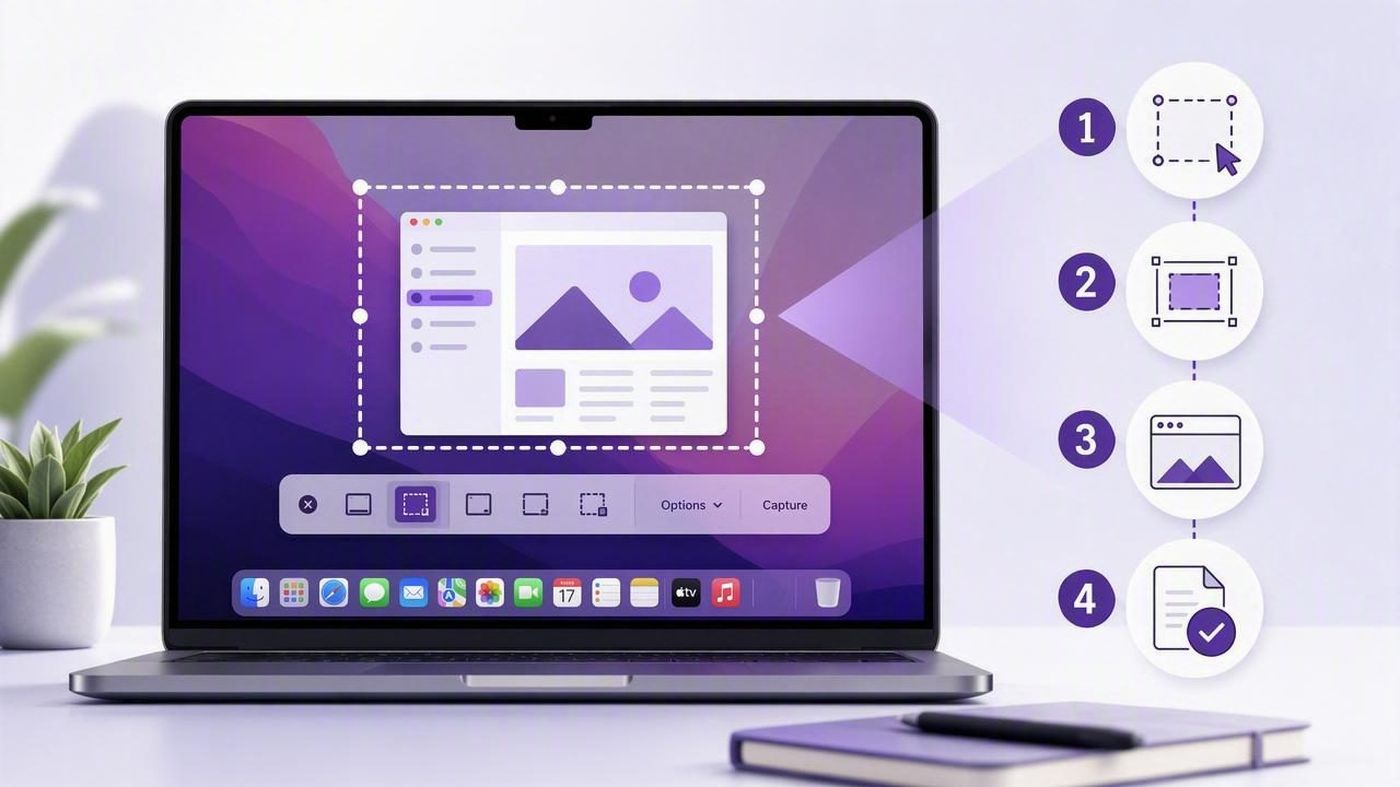
A Mac screenshot tool with numbered steps can turn a confusing explanation into a clear visual instruction in seconds. Instead of writing, “Click the blue button in the top-right area, then open the menu beside it,” you can show the exact screen and add numbered markers that guide the reader from one action to the next.
This approach is useful for software tutorials, bug reports, client feedback, onboarding documents, support tickets, and internal process guides. A well-annotated screenshot reduces follow-up questions because the recipient can immediately see what to click, what to ignore, and what happens next.
While macOS includes basic screenshot shortcuts and markup tools, dedicated screenshot apps can streamline the full workflow: capture a region, add arrows or blur, place numbered steps, then copy, save, drag, or share the finished image. This guide explains how to create better step-by-step screenshots on a Mac and what to look for in the right tool.
Why Numbered Steps Make Mac Screenshots Easier to Understand
Screenshots are often clearer than text alone, but a raw image can still overwhelm the viewer. Modern apps contain sidebars, menus, notifications, buttons, tabs, and other interface elements competing for attention. Numbered step markers solve that problem by creating a visual sequence.
For example, a screenshot of a project-management dashboard may need to explain how to create a new task. A numbered annotation can identify:
- The project selector to open.
- The New Task button to choose.
- The title field to complete.
- The final save action.
The reader does not need to scan a long paragraph and match each instruction to the interface. The image provides context, while the numbers provide order. This is especially helpful when a tutorial includes several actions in a single screen.
Numbered screenshots also create more consistent documentation. Rather than using a different mix of circles, arrows, and labels for every image, teams can use a repeatable visual system that readers quickly recognize.
When to Use a Mac Screenshot Tool With Numbered Steps
Step markers are not necessary for every capture. A simple visual comment may only require an arrow or text label. Numbering becomes valuable when the screenshot represents a process, a sequence, or a list of locations the viewer must inspect.
- Software tutorials: Show customers how to configure settings, create an account, or complete a workflow.
- Bug reports: Document the exact path that leads to an error before attaching console output or reproduction details.
- Client feedback: Identify requested design changes without making a long written list difficult to interpret.
- Employee onboarding: Create visual instructions for internal tools, expense systems, dashboards, or shared folders.
- Quality assurance: Point to multiple UI issues in one capture, such as spacing, alignment, broken labels, or unexpected states.
- Knowledge-base articles: Help readers follow product instructions even when they are unfamiliar with the interface.
The goal is not to add numbers everywhere. Use them when sequence matters. If you are simply pointing out a single issue, one arrow and a short note are often more direct.
A Simple Workflow for Creating Numbered Screenshots on Mac
1. Capture only the useful area
Start with a region capture whenever possible. Cropping the image before annotation removes distractions and helps the reader focus. Capture the entire display only when the broader layout matters, such as explaining multiple monitors, a full browser window, or a system setting that depends on the menu bar.
A clean region capture should include enough surrounding interface to establish context, but not so much that the important control becomes tiny. Before capturing, close unrelated windows, hide personal notifications, and remove unnecessary browser tabs if they may distract from the task.
2. Add numbered markers in reading order
Place markers where the reader naturally expects to begin: usually from top to bottom and left to right. Keep the sequence intuitive. If step 1 is in the lower-right corner and step 2 is at the top-left without a reason, the reader may pause or misread the flow.
Position each marker close to the relevant control without covering the label, button text, or important data. If the interface is dense, use a short arrow from the marker to the destination. This preserves clarity while avoiding overlap.
3. Use other annotations selectively
Numbered steps work best alongside a small set of supporting annotation tools:
- Arrows for precise direction when a marker cannot sit directly beside the target.
- Shapes such as rectangles or circles to group a panel or emphasize a larger area.
- Text labels for short clarifications like “Choose this option” or “Expected result.”
- Blur to hide email addresses, account balances, customer names, API keys, or private messages.
Avoid using every annotation type at once. Too many arrows, colors, boxes, and notes can create the same confusion the screenshot was meant to remove.
4. Review before copying or sharing
Before exporting the image, check that every number is visible, the sequence is correct, and sensitive information is obscured. Zoom in to make sure text remains legible. If the recipient will view the screenshot in a chat app or support system, test whether the reduced preview size still makes the annotations understandable.
Then choose the appropriate delivery method. Copying to the clipboard is fast for Slack, email, issue trackers, and documents. Saving locally is useful for reusable documentation. Drag-and-drop can speed up uploads to a browser or messaging app.
Annotation Design Tips for Clear Step-by-Step Screenshots
Good screenshot annotation is a form of visual editing. The image should communicate the action quickly, not show off every available drawing tool.
| Design choice | Best practice | Why it helps |
|---|---|---|
| Marker size | Use large, readable numbers without hiding the interface. | Readers can understand the sequence at a glance. |
| Color | Use one high-contrast accent color consistently. | Consistency makes annotations easier to scan. |
| Text | Keep labels short and action-oriented. | Long notes belong in the surrounding article or ticket. |
| Spacing | Leave room between nearby markers. | Closely packed numbers can look like a single group. |
| Privacy | Blur sensitive details before export. | Prevents accidental disclosure in shared screenshots. |
For longer procedures, do not force every step into one massive image. Use multiple screenshots when the user moves between pages or when individual controls would become too small. A short sequence of focused images is usually easier to follow than one crowded capture.
Privacy Considerations for Screenshot Workflows
Screenshots frequently contain more information than intended. A browser capture might reveal open tabs, customer records, bookmarks, account avatars, internal URLs, or personal messages. Before sending any image, inspect it as if it were going to a public audience.
A local-first screenshot workflow can be especially useful for teams handling client data, unreleased product designs, financial information, or internal systems. Look for tools that let you capture and annotate locally by default rather than automatically uploading every image to a third-party service.
When cloud sharing is needed, it should be intentional. Optional sharing through a storage account you control can be more appropriate than automatic public links. Regardless of the tool, confirm where screenshots are stored, how long links remain active, and whether your organization has sharing requirements.
How Dedicated Screenshot Apps Compare With Built-In macOS Tools
macOS screenshot shortcuts are useful for quick captures. Press Shift-Command-4 to select a region or Shift-Command-3 to capture the full screen. The built-in markup experience can handle basic edits, but dedicated tools are often faster for frequent documentation and feedback work.
| Workflow need | Built-in macOS tools | Dedicated screenshot app |
|---|---|---|
| Quick region capture | Strong for occasional use | Strong, often with faster post-capture options |
| Numbered step markers | Limited or manual | Typically designed for repeatable instruction workflows |
| Annotation speed | Suitable for basic markup | Usually offers focused arrows, blur, shapes, text, and history |
| Privacy controls | Local by default | Varies; check storage and sharing behavior carefully |
| Sharing workflow | Manual save or copy | May include drag-and-drop, clipboard actions, or optional cloud sharing |
When comparing screenshot apps such as CleanShot X, Shottr, Xnapper, Snagit, Dropshare, or Monosnap, focus on your actual workflow rather than the longest feature list. Some people need scrolling capture or screen recording. Others only need region capture, clean annotations, numbered steps, and easy copying. A simpler app can be the better choice when it removes friction from a repeated task.
A Repeatable Checklist Before You Send a Screenshot
- Does the capture include only the relevant interface area?
- Are the numbered steps in a logical order?
- Can the reader see the target control beneath or beside each marker?
- Have you blurred private or confidential information?
- Are arrows, shapes, and labels used only where needed?
- Will the image remain readable when viewed at a smaller size?
- Have you chosen an appropriate local save, clipboard, or sharing method?
This short review takes less than a minute and can prevent confusing instructions, unnecessary support requests, and accidental data exposure.
Make Every Screenshot an Instruction, Not Just an Image
A Mac screenshot tool with numbered steps helps transform visual communication into a practical guide. By combining focused region capture, clear markers, minimal annotations, and thoughtful privacy checks, you can create tutorials and feedback that people understand immediately.
For Mac users who prefer a focused, local-first workflow for captures and editable annotations, Snip Halo is one option to consider alongside the screenshot tools that best fit your needs.
