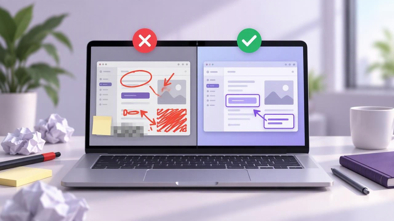
A screenshot can explain a bug, show a customer where to click, or make a tutorial easier to follow. But a poorly captured or over-annotated image can create more questions than it answers. Knowing the common Mac screenshot editor mistakes to avoid helps you create visuals that are clear, useful, and easy to share.
The best workflow is not necessarily the one with the most tools. It is the one that captures the right information, emphasizes what matters, and delivers the image in a format and location that suits its audience. Use these tips to improve screenshot editing on Mac, whether you are writing support instructions, documenting a bug, or giving visual feedback.
1. Capturing too much of the screen
A full-screen capture is useful when context matters, but it can also include unrelated windows, desktop clutter, or private notifications. Those details compete with the part you want someone to inspect. Before capturing, decide whether the recipient needs the whole display or only a specific area.
Use region capture for a dialog, interface element, or small design detail. Choose full-screen capture when the location of the issue matters, such as a layout problem that spans multiple windows. A tighter image usually takes less time to understand and is easier to annotate.
2. Cropping away useful context
The opposite problem is framing the screenshot so tightly that the recipient cannot tell where to look. A button without its surrounding panel may be hard to identify; an error message without the page or app window may be impossible to reproduce.
Leave enough surrounding interface to orient the viewer. For a bug report, include the relevant page title, dialog, or navigation area when it helps explain the issue. Review the crop at its intended display size: if the subject is obvious without a long explanation, the framing is probably working.
3. Marking up before checking the image
It is tempting to start drawing arrows as soon as the capture appears. First, inspect the image itself. Check that the correct display or window was captured, the content is readable, and no sensitive information is visible. Editing the wrong screenshot wastes time and can lead to an accidental disclosure.
A short review also helps you notice whether the image needs a crop, a different capture, or no annotation at all. Sometimes a clean screenshot is more persuasive than one covered in visual cues.
4. Using too many arrows and shapes
Arrows, circles, and rectangles can direct attention, but every added mark competes for it. Several arrows pointing in different directions make a simple task feel complicated. A heavy outline can also obscure the control it is meant to highlight.
Use the smallest number of marks needed to make the point. Pick one visual style and apply it consistently. For example, use a single arrow to indicate a control and a subtle rectangle to identify a larger area. If the annotation is more noticeable than the subject, simplify it.
5. Choosing annotation colors without considering contrast
A color that stands out against a light page may disappear on a dark interface. Thin lines can be especially difficult to see when a screenshot is resized or viewed on a different display. Before saving, check that arrows and shapes remain visible against the background beneath them.
Favor clear contrast and readable line weight over decorative color choices. If you are sharing a series of images, keep the color meaning consistent. For instance, the same color can identify the next action in every step, while a different color can signal a problem.
6. Adding too much text to the screenshot
Long explanations inside an image can become tiny, crowded, or hard to update. Screenshot text is most effective when it labels something briefly, such as a field name or a short warning. Put fuller context in the accompanying message, bug report, or tutorial.
Check text size at the scale recipients are likely to view. If a label is only readable when zoomed in, enlarge it or move the explanation outside the image. Keep wording direct, and avoid placing text over important interface details.
7. Skipping numbered steps in a multi-action task
When an image explains a sequence, arrows alone may not show which action comes first. Readers can follow the wrong direction or mistake separate controls for alternatives. Numbered step markers make the order explicit without requiring a paragraph beside every item.
Use one marker per action and place it near the relevant control without covering it. Keep the numbering sequence logical, and make sure the written instructions use the same order. For longer procedures, consider splitting the task into multiple screenshots rather than squeezing every step into one crowded image.
8. Blurring sensitive information incompletely
Names, email addresses, account details, customer records, and browser tabs can appear in captures unexpectedly. If you need to share the image, inspect the entire frame for information that should remain private—not just the central subject.
Apply blur or another effective concealment treatment to the full sensitive area. Then review the result at normal size and at higher magnification to check for exposed text around the edges. Do not assume a crop or a quick visual glance has removed every identifying detail.
9. Forgetting that annotations change the evidence
For bug reports, the screenshot should help someone understand what happened. An annotation can clarify a symptom, but it should not hide the original state or imply that an unverified cause is certain. Distinguish what you observed from what you suspect.
When clarity matters, preserve an unmarked original or capture a second annotated copy. Add a concise note about the steps that led to the issue, the expected result, and the actual result. The image supports the report; it does not replace the details needed to reproduce the problem.
10. Saving in a format that does not fit the job
Before exporting, consider how the screenshot will be used. A format that preserves crisp interface text is usually preferable for documentation, while a smaller file may be more practical for quick messages. Check the exported image rather than assuming it matches the editor preview.
Use a descriptive filename when the image will be stored with project files or a support ticket. Names such as checkout-error-after-submit are easier to search for than a generic label. If a tool offers copy, save, or drag-and-drop options, choose the route that fits the destination and confirm the image arrived correctly.
11. Sharing without checking where the image goes
Some screenshot workflows keep captures on the Mac until you choose to share them; others may upload images to a cloud service or create a shareable link. These behaviors affect privacy, access, and how long an image remains available. Do not assume every screenshot app handles files the same way.
Before sharing, check the destination, link permissions, and whether the image contains information intended only for a specific person. For confidential material, use an approved location and avoid public links. A local-first workflow can be useful when you want captures and recent history to remain on your Mac by default, with sharing as an explicit choice.
12. Choosing an editor by feature count alone
A screenshot app comparison can quickly turn into a checklist of features. But a tool with extensive editing, recording, hosting, or team features may be more than a simple capture-and-annotate workflow requires. On the other hand, a minimal editor may not suit a team that needs shared libraries or advanced editing.
Compare apps by asking how often you use their features, where images are stored, how sharing works, and what the total cost looks like over time. Consider whether you need region and full-screen capture, arrows, shapes, text, blur, numbered steps, or a particular export workflow. Compare CleanShot X, Shottr, Xnapper, Snagit, Dropshare, and Monosnap based on your actual tasks rather than assuming one option fits everyone. Also check current platform requirements, licensing, and privacy details before choosing.
A quick pre-share checklist
Before sending a screenshot, take a moment to confirm that it communicates the right thing:
- Capture: Is this the right window, region, or full display?
- Context: Can the recipient identify where the issue or action appears?
- Annotations: Are arrows, shapes, text, or step markers clear and restrained?
- Privacy: Have you checked for sensitive details and verified any blur?
- Delivery: Is the file saved or shared through the intended destination and access setting?
Build a screenshot workflow that stays simple
Effective screenshot editing is a sequence of small decisions: capture only what is useful, preserve enough context, annotate with restraint, and review the final image before sharing. These habits make bug reports easier to reproduce, tutorials easier to follow, and visual feedback less ambiguous.
Choose a Mac screenshot editor that fits those everyday needs, not just an impressive feature list. If you prefer a focused native Mac app with local captures by default and optional Google Drive sharing, Snip Halo is one option to consider. Whichever tool you use, a careful workflow will do more for clarity than adding another annotation.
