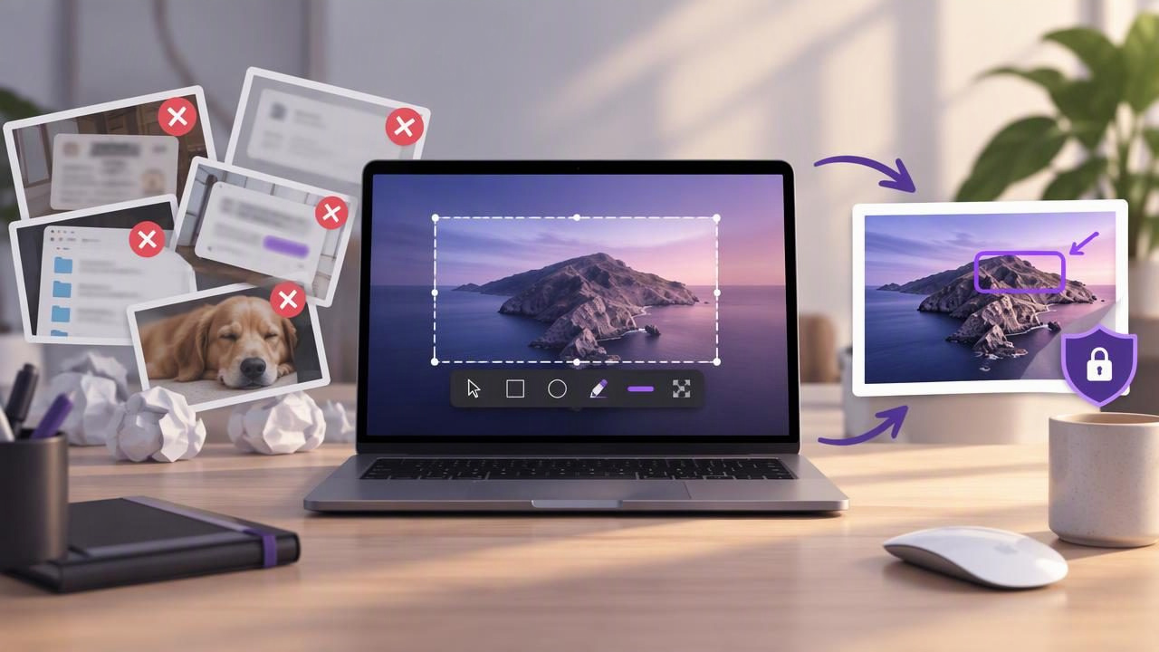
A local-first screenshot app can make it easier to document a bug, explain a process, or give clear visual feedback without sending every capture to an online service. But choosing a tool that stores files locally is only part of a good workflow. Capture choices, annotations, file handling, and sharing habits all affect how useful—and private—your screenshots are.
Whether you are comparing Mac screenshot apps or improving a workflow you already use, these common mistakes are worth avoiding. A few practical changes can make screenshots clearer, easier to manage, and safer to share.
1. Assuming “local-first” means every action stays private
Local-first generally means the app keeps captures and working history on your device by default. It does not necessarily mean that every feature operates offline or that every sharing route avoids the cloud. Some apps offer optional uploads, cloud libraries, or links that send images to a hosted service.
Before capturing sensitive material, check how the app handles recent history, exports, and sharing. Find out whether uploads require an explicit action and whether the app records anything in the background. A privacy-conscious workflow should make it clear where an image goes and who can access it.
2. Capturing more of the screen than you need
A full-screen capture is useful when context matters, such as showing how a window relates to a menu bar or another app. For most bug reports and instructions, though, extra desktop clutter makes the important detail harder to find. It can also expose unrelated messages, account names, or open tabs.
Choose a region capture when the issue is confined to one control, dialog, or section of a page. Include enough surrounding interface to identify the location, but crop out irrelevant content. Before saving, inspect the edges of the image for notifications or personal details.
3. Using annotations without a clear purpose
Arrows, shapes, and text should guide attention, not decorate a screenshot. Too many marks compete with the interface and make the image feel harder to interpret. A useful annotation answers a specific question: where should the reader look, what happened, or what action should they take?
- Use an arrow to point to a precise control or error.
- Use a rectangle or circle to highlight an area without obscuring it.
- Add a short text label when the visual alone may be ambiguous.
Keep the original capture available while editing, if your app supports that workflow. Then you can revise an annotation rather than recapturing the screen because a mark covered important information.
4. Relying on color alone to communicate
A red circle may stand out, but color is not always enough. The recipient may have difficulty distinguishing the color, view the image on a low-quality display, or print it in grayscale. A color mark can also blend into a similarly colored interface element.
Combine color with shape, position, or a brief label. For example, use a numbered marker beside a highlighted button and explain the action in the accompanying message. This creates more robust visual feedback without filling the screenshot with text.
5. Making numbered steps hard to follow
Numbered step markers work well for tutorials, onboarding, and multi-part bug reproduction. They become confusing when numbers are missing, repeated, or scattered in an order that does not match the written instructions. Small markers can also disappear when an image is resized.
Plan the sequence before adding markers. Place each number close to the relevant interface element while keeping it clear of labels and controls. If a process has many steps, split it into several screenshots instead of compressing a long procedure into one crowded image.
6. Treating blur as a substitute for checking the image
Blur can hide an email address, customer name, or other visible detail, but it is easy to miss information elsewhere in the capture. Look beyond the main window: notification previews, browser tabs, profile menus, and desktop files may also reveal sensitive data.
Apply blur only to the information that needs protection, then review the whole image at its final export size. Make sure the obscured area cannot be read around the blur or through an uncovered part of the same field. When details are especially sensitive, consider capturing a clean test account or a smaller region instead.
7. Sharing before checking the destination
Copying an image to the clipboard, saving it to a folder, dragging it into a message, and sharing through cloud storage are different actions. Confusing them can lead to a file being saved in the wrong place or a link being sent to the wrong audience.
Pause before sharing and confirm the destination and access settings. If you use optional Google Drive sharing, check the selected account and link permissions before sending. For a one-to-one message, attaching the image directly may be more appropriate than creating a broadly accessible link.
8. Ignoring file names and organization
Names such as Screenshot 42 are difficult to search later. A screenshot may be easy to understand in the moment but nearly impossible to identify in a folder full of generic files. This is especially frustrating when you need to revisit a bug report, update a tutorial, or compare interface changes.
Use a short, consistent naming pattern that includes the project or topic and, where useful, a date or step number. Keep only the versions you need, and separate working captures from approved images. Local storage can improve control, but it still benefits from an orderly file system.
9. Choosing an app by feature count alone
A long feature list does not guarantee a better screenshot workflow. Some Mac apps focus on cloud sharing, scrolling capture, recording, or team libraries; others prioritize quick region capture and simple annotation. Consider what you actually do each week before paying for features you may rarely use.
When comparing CleanShot X alternatives such as Shottr, Xnapper, Snagit, Dropshare, or Monosnap, look at more than the capture button. Ask where captures are stored, whether uploads are optional, which annotation tools are available, and how the app is licensed. A one-time purchase may suit someone who prefers predictable costs, while another workflow may justify a subscription or team service.
10. Skipping a final review before sending
A quick review catches mistakes that are easy to overlook during editing: a cropped-off error message, a tiny label, a misplaced arrow, or an annotation that hides the control it is meant to explain. Open the exported image—not just the editor preview—and check it at a realistic viewing size.
For a bug report, confirm that the screenshot supports the written reproduction steps. For a tutorial, make sure the sequence is consistent and that each image communicates one clear action. A few seconds of review can prevent a follow-up explanation or a second round of feedback.
A safer, clearer Mac screenshot workflow
- Decide what the image needs to prove. Identify the error, action, or interface area the recipient should notice.
- Capture the smallest useful view. Use a region when it provides enough context; choose full-screen capture only when the broader layout matters.
- Annotate selectively. Add arrows, shapes, text, blur, or numbered steps only when each mark improves understanding.
- Review privacy and legibility. Check the entire image for exposed details and confirm that annotations remain readable.
- Choose the right output. Copy, save, drag, or share according to the recipient and the sensitivity of the content.
This sequence works for a developer reporting a visual defect, a support specialist explaining a setting, or a writer building a step-by-step guide. It also helps keep screenshot work intentional instead of turning every capture into an automatic upload or an unorganized file.
What to look for in a local-first screenshot app
A practical Mac screenshot app should make core tasks straightforward: capture a region or full display, add useful annotations, and copy or save the finished image. For privacy, look for local storage by default, no automatic uploads, and clear controls around optional sharing. For everyday value, consider whether the pricing model and device limit fit your needs.
There is no universal best screenshot app. The right choice depends on whether you prioritize editing depth, speed, team collaboration, or a simple local workflow. Test the steps you perform most often, not just the feature list on a comparison page.
Make every screenshot easier to trust
A local-first approach gives you more control over where captures live, but good habits complete the picture. Capture only what is relevant, annotate with restraint, inspect sensitive details, and verify the destination before sharing. These small choices make bug reports, tutorials, and visual feedback clearer while reducing avoidable privacy and organization problems.
If you want a focused native Mac workflow for local captures, annotation, and optional Google Drive sharing, Snip Halo is one app you can include in your comparison.
