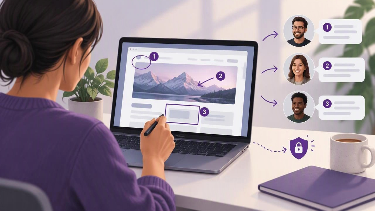
When a client asks for a design revision, a paragraph of directions can leave plenty of room for interpretation. “Move the button a little higher” may sound clear until someone wonders which button, how far, and on which screen. A marked-up screenshot answers those questions at a glance.
A practical Mac screenshot workflow can help you capture the right context, add arrows or notes, and send a useful image without turning feedback into a long meeting. Whether you are reviewing a website, app prototype, document, or presentation, the goal is the same: make the next action obvious while sharing only the information the recipient needs.
This guide explains how to send visual client feedback with a Mac screenshot app, from choosing a capture area to writing concise annotations and delivering the finished image.
Why visual feedback works better than vague directions
Written feedback is essential for explaining intent, but it can be difficult to connect a sentence to a precise location on a screen. A screenshot creates a shared reference. The client can see the element being discussed, the surrounding layout, and the suggested change in one place.
Visual feedback is especially helpful when you need to:
- Point out a specific button, label, image, or spacing issue.
- Show where a page should continue or which section needs attention.
- Explain a sequence of actions in a product interface.
- Report a bug with the visible state and relevant controls in view.
- Compare a current design with a proposed direction.
It does not mean every comment should be drawn on an image. Use text for reasoning, priorities, and questions. Use the screenshot to show exactly where that explanation applies. Combining the two usually produces more useful feedback than either one alone.
1. Choose the right capture: region or full screen
Start by deciding how much context the recipient needs. A region capture is useful when one element is the focus, such as a form field or icon. It creates a compact image that is easy to scan and share. Capture enough of the surrounding interface to make the location recognizable; an isolated button may be hard to identify when separated from its page.
Use a full-screen capture when the overall layout matters, when a problem spans several areas, or when you need to demonstrate what was visible during a bug. A full display can also help explain a workflow that crosses windows. If the desktop contains unrelated material, close or move it before capturing, or choose a smaller region instead.
Before taking the screenshot, check that the page is in the state you want to discuss. Open the relevant menu, scroll to the correct section, and wait for content to finish loading. Remove temporary overlays where possible. These small steps prevent follow-up questions about whether the image shows the intended version.
2. Keep annotations simple and specific
Once you have the capture, use a small number of marks to guide the reader. The best annotations clarify the message rather than decorate the screenshot.
- Arrows: Point to a precise element or show a direction of movement. Keep the arrowhead away from nearby items that could be mistaken for the target.
- Shapes: Use a rectangle or circle to highlight an area. Make the outline large enough to include the relevant component, but not so large that it covers other details.
- Text: Add a short note for context, such as “Increase spacing above this heading.” Keep explanations that need nuance in the accompanying message.
- Blur: Obscure private information that is not necessary for the review, including names, email addresses, account details, or unrelated notifications.
- Numbered markers: Use numbered steps when the reader must review several changes in order or follow a process.
Use consistent colors and sizes across a set of screenshots. For example, one color for requested changes and another only when you are distinguishing questions from required revisions. Avoid adding so many circles, arrows, and labels that the original interface becomes difficult to see.
3. Turn several notes into an easy sequence
Numbered markers work well when one image contains multiple comments. Place a marker beside each point, then use a short list in your message to explain what each number means. This keeps the screenshot readable while preserving enough detail to act on.
- Capture the page or screen that shows the full area under review.
- Add one numbered marker for each distinct change request.
- Write a matching list in the same order, using clear action verbs.
- Check that every number in the message has a visible counterpart in the image.
For instance, a review could say: “1. Align this button with the field above it. 2. Replace the placeholder text with the approved label. 3. Keep the current image crop.” This is more actionable than “Please clean up the form,” because the recipient knows which edits to make and which part should remain unchanged.
If a sequence involves many screens, do not squeeze every instruction into one image. Make separate captures for distinct stages and label them in a clear order. A short series is often easier to follow than a single crowded screenshot.
4. Write a message that gives the image purpose
A screenshot needs a little context when it arrives in an email, project board, or chat. Include the page or feature name, the reason for the feedback, and what you want the recipient to do next. This helps the image make sense if it is viewed later or separated from the original conversation.
A useful format is:
Page: Checkout confirmation
Goal: Make the next step easier to notice
Requested change: See markers 1 and 2 in the attached screenshot
Question: Can we retain the current confirmation message?
Use direct, neutral language. “Could we increase the contrast on this label?” is clearer and more collaborative than “This looks bad.” If you are unsure whether a detail is a defect or a preference, state that uncertainty: “I noticed this on the mobile layout—could you confirm whether it is intentional?”
Separate must-fix issues from optional ideas. You might label feedback as “required before approval” or “suggestion for consideration.” That distinction helps the client prioritize and prevents a minor preference from being mistaken for a blocker.
5. Protect sensitive details before sharing
A screenshot can include more than the design under review. Browser tabs, desktop notifications, customer records, and account details may be visible around the target area. Inspect the entire image before you send it, even when you captured only part of the screen.
Use blur or another appropriate redaction method for information the recipient does not need. Whenever possible, avoid capturing sensitive content in the first place: close private windows, dismiss notifications, and navigate to a sample account. Remember that cropping is not the same as removing sensitive information if the original, uncropped file is also being shared.
Consider where the capture will be stored and how it will reach the client. Some screenshot workflows keep images local until you decide to copy, save, or share them. Others can upload images to a hosted service. Neither approach is automatically right for every project, but you should know whether a screenshot leaves your Mac, who can access a link, and whether the image contains confidential material.
6. Choose a delivery method that fits the project
For a quick comment, copying an annotated image and pasting it into a client conversation may be enough. Saving the image as a file is useful when the project needs a record, when several captures belong together, or when the client’s system does not accept pasted images. Dragging a capture directly into a compatible app can make a short review feel more natural.
For longer-lived feedback, use the project’s approved storage or review platform and include a descriptive filename. Names such as checkout-confirmation-review are easier to find than generic names such as Screenshot 12. If you share a link, check its access settings rather than assuming anyone with the link should be able to view it.
Make sure the final image is legible at its expected size. Tiny text may look readable on your display but become difficult to inspect in a compressed chat preview. If the annotation depends on detailed wording, add that wording in the message too.
A final review checklist
Before you send your visual feedback, take a moment to check the image and message together:
- Does the capture show the correct page and state?
- Is there enough context to locate the issue?
- Does every arrow, shape, or number point to the intended item?
- Are the requested actions specific and easy to prioritize?
- Have you blurred or removed private information?
- Can the recipient open the image using the chosen delivery method?
This quick review can prevent a common cycle: sending an unclear image, answering questions about what it means, and then sending a second explanation. A little preparation makes the feedback easier to understand and easier to act on.
Make feedback clear without making the workflow complicated
The most effective visual client feedback is not the most heavily annotated. It is the feedback that connects a clear capture with a specific request, protects information that should not be shared, and gives the recipient an obvious next step. Region and full-screen capture each have a place; choose based on how much context the task requires.
When evaluating a Mac screenshot app, look for the tools your process actually uses: reliable capture, arrows and shapes, text, blur, and numbered steps if you review multi-part work. Also consider how the app handles recent images and sharing. A local-first workflow can be useful when you want captures to stay on your Mac unless you choose to send them. For teams that prefer a straightforward, one-time purchase, Snip Halo is one option to consider; the best fit depends on your own review and privacy requirements.
