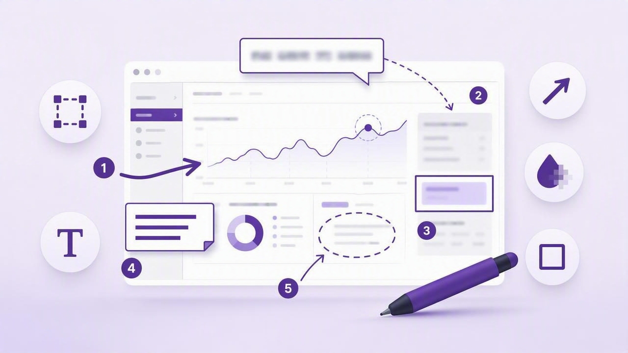
When a message includes phrases like “click the button on the right” or “the layout looks wrong here,” it leaves room for interpretation. Which button? What part of the layout? Is the problem spacing, color, copy, or functionality? Screenshots eliminate much of that ambiguity, but an unmarked screenshot can still force the recipient to guess.
Learning how to get clearer visual communication with a screenshot annotation tool helps teams explain issues, provide feedback, create tutorials, and document processes faster. Instead of writing several paragraphs to describe a small interface detail, you can capture the relevant screen area and add an arrow, label, blur, or numbered step.
The goal is not to decorate screenshots. It is to create visual instructions that are immediately understandable, appropriately detailed, and safe to share.
Why plain screenshots often create confusion
A basic screenshot preserves what was on screen, but it does not reveal what the sender wants the viewer to notice. On a busy dashboard, web page, spreadsheet, or design mockup, the important detail may represent only a few pixels of the entire image.
Without context, a recipient may need to ask follow-up questions:
- Is this the exact field that needs changing?
- Should I click the icon, the row, or the menu?
- What order should these actions happen in?
- Is this visible customer information safe to forward?
- Is the red area an error, a suggested change, or just an example?
Each question adds delay. In support conversations, bug reports, client reviews, and internal documentation, those delays can turn a simple clarification into a long thread. Screenshot annotation reduces this back-and-forth by pairing the visual evidence with a clear direction.
A useful annotated screenshot answers three questions at a glance: what to look at, what it means, and what to do next.
Choose the right capture scope first
Clear communication starts before you add any markup. The capture itself should include enough context for the viewer to understand the problem, but not so much that the important detail gets lost.
Use region capture for focused instructions
A region capture is usually best for targeted feedback and short how-to steps. Capture only the dialog, setting, form section, or interface component involved. A smaller image is easier to inspect in chat, email, and project-management tools.
For example, if you need a teammate to change a notification setting, capture the settings panel rather than the entire desktop. Then add an arrow and a short label such as Enable this option.
Use full-screen capture when context matters
Full-screen capture is useful when the broader environment explains the issue. This may include a bug that appears only in a particular browser, an interaction between two windows, a missing menu item, or an unexpected result after a workflow step.
When using a full display screenshot, make the focal point obvious. A shape, highlight, or numbered marker prevents the recipient from scanning the entire screen to find the relevant area.
The essential screenshot annotation tools and when to use them
Different annotation types communicate different kinds of information. Using the right one makes your screenshots easier to read and more professional.
| Annotation | Best use | Example |
|---|---|---|
| Arrow | Direct attention to one precise element | Point to the Save button or error message |
| Rectangle or circle | Group or outline an area | Highlight an entire toolbar section |
| Text label | Explain a change, warning, or instruction | “Use the staging URL here” |
| Blur or redaction | Hide private or irrelevant information | Mask names, emails, API keys, and account data |
| Numbered marker | Show a sequence of actions | 1. Open menu, 2. Choose Export, 3. Confirm |
Arrows: ideal for a single point of attention
Arrows are among the fastest ways to clarify an interface. They work well when there is one action to perform or one visual defect to review. Keep arrows short where possible and avoid crossing multiple arrows over the same area.
If a screen contains several similar controls, an arrow is more effective than a vague instruction such as “select the third icon.” Point to it directly.
Shapes: useful for areas, patterns, and comparisons
Use rectangles and circles when the message concerns a group of elements rather than one button. A rectangle can frame a broken card layout, while circles can identify two items that should match but do not.
Try not to box every element on screen. Excessive outlines make a screenshot feel noisy and reduce the importance of each markup.
Text: add meaning, not repetition
Text labels should provide information that the screenshot cannot communicate by itself. Good labels explain why something matters or what should happen next. Avoid labels that merely repeat what is already obvious.
- Weak: “Button”
- Better: “This button should remain disabled until a file is selected.”
- Weak: “Wrong”
- Better: “Heading wraps at 1024 px; keep it on one line.”
Use numbered steps for workflows, not just screenshots
Numbered step markers are especially valuable when a recipient must perform actions in a specific order. They turn a static image into a compact visual procedure.
Consider a support response for exporting a report. Rather than sending separate messages, create one annotated screenshot and pair it with a concise list:
- Open the report options menu.
- Select Export CSV.
- Choose the date range.
- Click Download.
The numbers in the image should align exactly with the written steps. This makes the workflow accessible to viewers who prefer visual directions and to people who need a quick confirmation while following text instructions.
For longer processes, use one screenshot per major stage rather than crowding ten markers onto a single image. A sequence of clean images is easier to follow than one overloaded capture.
Blur sensitive details before sharing
A screenshot may contain more information than intended: customer names, email addresses, financial details, internal URLs, browser tabs, access tokens, private messages, or account identifiers. Before sending a capture outside its original context, scan the full image for information that should not be visible.
Blur is often preferable to cropping when the hidden content provides useful layout context. For instance, you may want to show where an account name appears in a page header without exposing the actual name.
Create a quick privacy checklist before sharing screenshots:
- Blur customer, employee, and personal contact details.
- Hide passwords, keys, tokens, and recovery codes completely.
- Check browser tabs, bookmarks, notifications, and desktop files.
- Remove irrelevant data from tables and reports.
- Confirm that sharing settings match the intended audience.
For sensitive work, local-first screenshot workflows offer an additional advantage: captures can remain on the device until you deliberately copy, save, drag, or share them.
Build clearer bug reports with annotated evidence
Bug reports are one of the strongest use cases for screenshot annotation. Developers and QA teams need both reproducible details and visual evidence. A screenshot cannot replace written reproduction steps, but it can make the reported outcome unmistakable.
A useful visual bug report typically includes:
- A focused capture of the affected screen.
- An arrow or shape around the unexpected behavior.
- A label describing the actual result.
- Brief context about the expected result.
- Environment details, such as browser, device, or screen size.
Expected: The confirmation banner appears after saving.
Actual: No banner appears, and the Save button remains loading.
Steps: Edit profile name → click Save.
Environment: macOS, Safari, 1440 × 900 display.
Keep the screenshot focused on the evidence, while keeping technical reproduction details in the accompanying ticket. This division makes both components easier to review.
Common mistakes that weaken visual communication
Even well-intentioned annotations can become less useful when they are cluttered or inconsistent. Watch for these common problems:
- Too much markup: Limit annotations to the details needed to explain the message.
- Tiny text: Labels must remain readable when viewed in a chat window or email preview.
- Ambiguous colors: Do not rely on red alone to mean “wrong” or green alone to mean “correct.” Add a label when meaning matters.
- Missing context: A tight crop may hide the page title, selected tab, or state that explains the issue.
- Unclear action: Highlighting a problem is not enough; say what should change or happen next.
- Unsafe sharing: Always review captures for confidential information before exporting or uploading.
A practical workflow for annotated screenshots on Mac
An efficient Mac screenshot workflow should feel quick enough to use every day. The following process works for tutorials, design feedback, support replies, and internal documentation:
- Decide whether a region or full-screen capture provides the right context.
- Capture the screen at the moment that best shows the issue or instruction.
- Add one primary annotation first: an arrow, shape, or numbered marker.
- Add only the text needed to explain the intent.
- Blur private details and remove unnecessary visual distractions.
- Review the image at a smaller size to confirm labels remain legible.
- Copy, save, drag into another app, or share through an approved destination.
The best screenshot annotation tool is not necessarily the one with the longest feature list. It is the one that helps you capture, mark up, protect, and deliver an explanation without interrupting your work. For Mac users who want a focused, local-first option with optional Google Drive sharing, Snip Halo follows this practical capture-to-annotation workflow.
Make every screenshot answer a question
Clear visual communication comes from intent. Before sending an annotated screenshot, ask: What should the viewer notice, understand, or do after seeing this? If the image answers that question quickly, it is doing its job.
Use region capture to reduce noise, arrows and shapes to direct attention, text to add meaning, blur to protect privacy, and numbered markers to show order. With a consistent annotation workflow, screenshots become more than images—they become concise, useful instructions that move work forward.
