Written instructions are often slower than they need to be. A colleague may describe an interface issue as “the button near the settings area,” while a client might say “the page looks strange on the right.” Both messages leave room for interpretation, follow-up questions, and avoidable delays.
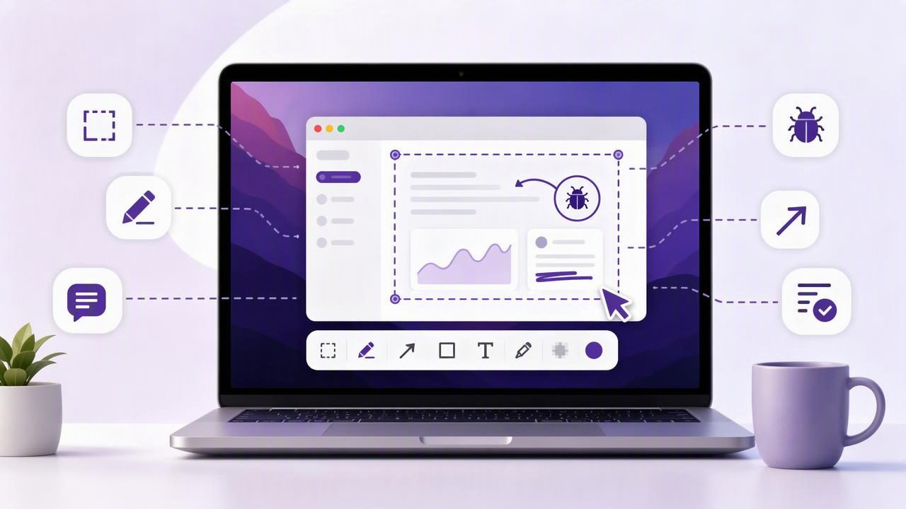
A well-made screenshot removes that ambiguity. It gives people a shared visual reference, shows precisely where an issue occurs, and provides enough context to take the next action. When you combine a clean capture with arrows, labels, blur, and numbered steps, a screenshot becomes more than an image: it becomes a concise communication tool.
This guide explains how to get clearer visual communication with a Mac screenshot app. Whether you are reporting a software bug, reviewing a design, writing a tutorial, helping a customer, or sharing internal feedback, the goal is the same: make your point understandable at a glance.
Why screenshots improve communication
Visual communication works because it reduces interpretation. Rather than asking someone to translate a paragraph into a mental image, you provide the image directly. This is especially useful when discussing interfaces, layouts, settings, forms, dashboards, and workflows.
Consider the difference between these two messages:
“The export option is missing after opening the menu in the project section.”
That message may be technically accurate, but the reader still has to identify the project section, find the menu, and determine which export option should appear. A screenshot with a numbered marker and a short label makes the same message immediately actionable.
Clear screenshots help teams and clients:
- Identify the exact part of a screen being discussed.
- Understand the order of actions in a workflow.
- Spot visual defects without reproducing vague descriptions.
- Review design changes more quickly.
- Protect private information while preserving useful context.
- Reduce long message threads and unnecessary meetings.
The most effective screenshot is not necessarily the most decorated one. It is the one that guides attention to the right place with the least possible effort.
Start with the right capture: region or full screen
Clear visual communication begins before annotation. The capture area determines how much context the viewer gets and how much visual noise they must ignore. On Mac, most screenshot tools support both region capture and full-screen capture, and each serves a different purpose.
Use region capture for focused feedback
A region capture is usually best when one interface element, message, panel, or design detail is the subject. Cropping to the relevant area makes text easier to read and prevents unrelated applications, browser tabs, or desktop clutter from distracting the reader.
For example, if you are reporting that a checkout form has an overlapping button, capture the form section and a small amount of surrounding page context. Do not capture an entire monitor if the rest of the display adds no value.
Use full-screen capture when context matters
Full-screen capture is useful when the issue depends on the entire environment. This includes multi-window workflows, display layout problems, app-to-app interactions, browser responsiveness, or an error that appears only after a particular sequence.
Before sharing a full-screen image, review it carefully. Close unrelated windows, hide notifications, and blur sensitive details. A full display can reveal email previews, account names, calendar entries, internal projects, or customer information.
| Capture type | Best for | Common risk |
|---|---|---|
| Region capture | UI feedback, small defects, feature callouts | Removing too much context |
| Full-screen capture | Workflow issues, multiple windows, display problems | Including private or irrelevant information |
| Window capture | App-specific documentation and support requests | Missing the action outside the window |
Use annotations to direct attention
A raw screenshot shows what happened. An annotated screenshot shows what matters. The strongest annotations are intentional, minimal, and visually consistent. If every part of an image is highlighted, nothing is truly emphasized.
Arrows: point to a specific target
Arrows are ideal for identifying one small control, visual defect, or destination. Use them when the viewer needs to look at a precise location, such as a misplaced icon, a menu item, or an unexpected error message.
Keep arrows short when possible. A long arrow crossing the entire image can make the screenshot feel cluttered. Choose a high-contrast color that remains easy to see against the interface, and avoid placing the arrowhead directly over important text.
Shapes: frame the area under review
Rectangles, circles, and outlines work well when the point is a larger region rather than a single pixel-level detail. A bordered box around a navigation panel, a form field group, or a broken card layout gives the reader a clear visual boundary.
Use a transparent or lightly filled shape if the underlying content needs to remain readable. An opaque highlight may hide the very problem you are trying to show.
Text labels: add only essential explanation
Text annotations should clarify the screenshot, not repeat an entire email or ticket. Short labels such as “Incorrect total,” “Expected spacing,” or “Click here first” are generally enough.
If your explanation requires several sentences, put the detail in the accompanying message and let the screenshot serve as the visual reference. This keeps the image readable when it is viewed on a smaller screen or pasted into a chat thread.
Turn a screenshot into a step-by-step guide
Numbered step markers are one of the simplest ways to create a tutorial without recording a video. They are especially useful for onboarding instructions, support replies, product documentation, and repeatable internal procedures.
Use numbered markers when the viewer must complete actions in a sequence. For example, a short guide for changing a browser permission might show:
- Open the account menu.
- Select Settings.
- Choose Privacy.
- Enable the required permission.
- Save the change.
A single screenshot can sometimes contain all five markers. In other cases, separate screenshots are clearer, particularly if each action changes the screen significantly. The decision should be based on readability, not on trying to fit every step into one image.
For consistent tutorials, place markers close to their targets, use a logical reading order, and avoid overlapping numbers with menus or buttons. Match the written list to the numbered markers exactly. If the image shows step 3 before step 2, users may lose confidence in the instructions even if the process is simple.
Blur private information without losing context
Screenshots frequently contain information that should not be shared: names, email addresses, phone numbers, customer records, billing data, API keys, access tokens, and internal URLs. Blurring is not an optional finishing touch; it is an important part of a responsible screenshot workflow.
Before exporting or sharing a capture, scan it from top to bottom. Check browser tabs, bookmarks, notification banners, user avatars, sidebars, chat previews, and address bars. Sensitive data often appears outside the area you initially intended to discuss.
Use a blur tool rather than drawing a thin line over confidential text. A partial cover can leave characters visible around the edges, while a properly applied blur obscures the content more reliably. When possible, create a separate test account or sample dataset for demonstrations so fewer areas need to be hidden.
Choose an export and sharing workflow that fits the audience
The best screenshot format depends on what the recipient needs to do next. For quick feedback in Slack, Teams, or a project tracker, copying the image to the clipboard and pasting it directly is often fastest. For documentation, saving a well-named image file makes it easier to find and reuse later.
A useful naming format might look like this:
project-page-area-issue-description.pngFor example:
client-portal-billing-total-overlap.pngDescriptive file names are particularly valuable when screenshots become evidence in a bug report or reference material in a knowledge base.
When sharing outside your organization, consider where the file is stored and who can access it. Some people prefer a local-first workflow in which captures remain on the Mac unless they actively choose to send them. Optional sharing through a personal cloud account can be useful when a link is needed, but automatic uploads may not suit every privacy policy or client relationship.
Build clearer bug reports with a simple screenshot template
A screenshot is most useful when paired with a concise report. You do not need a long technical document for every issue, but a repeatable structure helps developers, designers, and support teams act quickly.
Try this practical format:
- What happened: Describe the actual result in one sentence.
- What should happen: State the expected result.
- Where: Include the page, feature, device, or browser.
- How to reproduce: List the shortest reliable steps.
- Screenshot: Add arrows, labels, or a box around the issue.
For instance, instead of writing “The dashboard is broken,” write: “After selecting the April date range, the revenue chart overlaps the filter panel in Safari. Expected: the chart should remain below the filters.” Attach a screenshot with a box around the overlap and an arrow pointing to the selected date range.
Avoid these common screenshot communication mistakes
Even good screenshot software cannot fix an unclear message by itself. Watch for these common problems:
- Capturing too much: A full display makes a small issue difficult to find.
- Capturing too little: A tightly cropped image may hide the conditions that caused the problem.
- Using too many colors: Multiple bright colors compete for attention.
- Writing long paragraphs on the image: Put detailed explanation in the message or ticket instead.
- Forgetting privacy review: Always inspect the entire capture before sending.
- Skipping context: Include the relevant app, state, or preceding step when it affects the outcome.
Make visual communication a repeatable habit
The key to clearer screenshot communication is consistency. Capture the relevant area, add only the annotations that help, protect sensitive content, and send the image through the appropriate channel. Over time, teammates will learn how to read your visual feedback quickly, and your own documentation will become easier to maintain.
A focused Mac tool such as Snip Halo can support this workflow by combining capture, arrows, shapes, text, blur, and numbered steps while keeping screenshots local unless you choose to share them. Whatever tool you use, the real objective remains simple: help the next person understand exactly what you mean without needing to ask twice.
