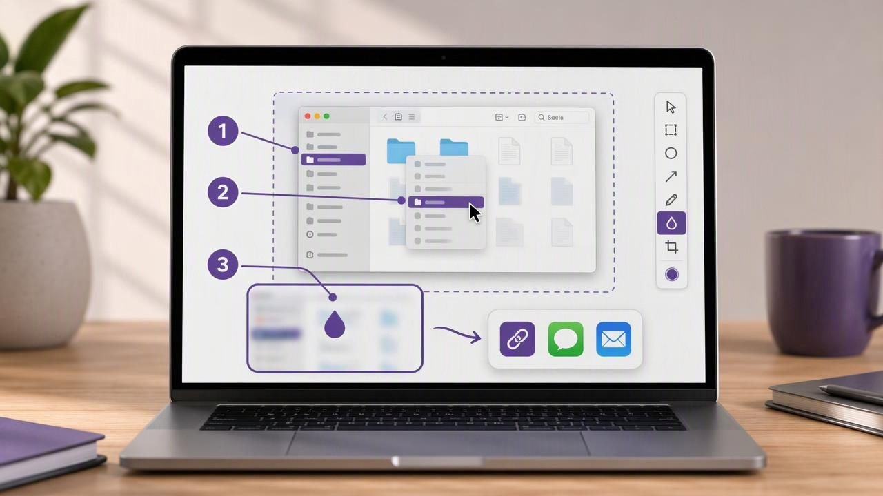
Written instructions often fail for a simple reason: people interpret words differently. A sentence such as “open the menu in the top-right corner” may be clear to the writer, but a reader can still click the wrong icon, miss a submenu, or overlook an important setting. Visual instructions remove much of that ambiguity.
If you are wondering how to create visual instructions on Mac, the most effective approach is usually a sequence of focused screenshots with concise annotations. A clear image can show exactly where to click, what to enter, what to ignore, and what the expected result should look like.
This guide explains a repeatable Mac screenshot workflow for creating tutorials, bug reports, onboarding guides, internal documentation, and client feedback. You will learn how to capture the right screen area, annotate it without clutter, add numbered steps, protect private information, and share instructions in a format people can use quickly.
Why visual instructions work better than text alone
Visual instructions lower the effort required to understand a task. Instead of translating text into an action, the reader can compare their screen with yours and follow a visible path. This is especially useful in software, where labels, icons, menus, and layouts matter.
Well-made visual instructions are valuable for:
- Customer support: Show users how to fix a common issue without writing a lengthy explanation.
- Bug reports: Document the exact steps that reproduce a problem for developers or QA teams.
- Employee onboarding: Teach new teammates how to use internal tools and repeatable processes.
- Product tutorials: Explain a feature in a way that is easy to scan and revisit.
- Design feedback: Mark specific UI elements instead of describing their location in vague terms.
- Personal workflows: Create checklists for recurring administrative, finance, or publishing tasks.
The goal is not to capture everything on screen. The goal is to show the next correct action with as little distraction as possible.
Choose the right screenshot type for each instruction
The foundation of a useful visual guide is the screenshot itself. On a Mac, you can take screenshots with built-in shortcuts, but a dedicated screenshot annotation workflow can make it easier to edit, label, copy, and organize captures before you share them.
| Screenshot type | Best use case | Why it helps |
|---|---|---|
| Region capture | Single buttons, forms, dialogs, menus | Keeps attention on the relevant area |
| Full-screen capture | Page layouts, dashboards, broad context | Shows where the task fits in the larger interface |
| Window capture | Standalone app workflows | Removes unrelated desktop clutter |
| Sequential captures | Multi-step procedures | Lets readers follow one action at a time |
For most tutorials, start with a region capture. A tightly cropped screenshot is easier to understand on a small laptop screen, in a knowledge base article, or inside a chat thread. Use full-screen capture only when surrounding context helps the reader identify the right part of the interface.
A practical workflow for creating visual instructions on Mac
The best instructions follow a consistent process. Rather than taking screenshots randomly while you write, complete the task once, identify the decision points, then capture each important moment.
1. Define the outcome before capturing anything
Begin with a clear result. For example:
- Enable two-factor authentication.
- Export a report as a CSV file.
- Invite a teammate to a project.
- Change a notification setting.
A focused outcome prevents a tutorial from becoming an unfocused tour of the interface. Ask: What should the reader be able to do after following these steps?
2. Break the task into atomic actions
Each screenshot should normally represent one action or one confirmation. If readers must click three places in a screenshot, they may not know which action comes first. Split the process into smaller images when sequence matters.
- Open the account menu.
- Select Settings.
- Choose Security.
- Turn on the required option.
- Confirm the success message.
This structure also makes guides easier to update. If a menu changes later, you can replace one image rather than rebuild the entire tutorial.
3. Capture a clean screen state
Before taking a screenshot, close unrelated windows, hide personal notifications, and remove anything that could distract from the action. If possible, use realistic but non-sensitive sample data. A clean capture looks more professional and reduces the amount of editing needed afterward.
Mac users can use built-in screenshot shortcuts such as Shift + Command + 4 for region selection and Shift + Command + 3 for full-screen capture. However, if you need immediate arrows, text, blur, and numbered markers, an annotation tool can reduce the back-and-forth between capture and editing apps.
4. Add one primary annotation per image
Annotations tell readers what matters. Use them deliberately. An arrow is ideal for a button, a rectangle can frame a panel, and a short text label can clarify an unfamiliar control. Avoid decorating every visible element.
A simple annotation hierarchy works well:
- Arrow: “Click here” or “look here.”
- Shape: Defines a larger area, section, field group, or selected state.
- Text: Adds a short explanation that cannot be conveyed visually.
- Blur: Hides sensitive information while preserving the layout.
- Numbered marker: Establishes action order across one or several screenshots.
Use a consistent annotation color throughout the guide. Red can work well for urgent errors, but a high-contrast blue, orange, or green may be easier to reuse in everyday documentation. Consistency helps people recognize your visual language immediately.
Use numbered steps for multi-click workflows
Numbered step markers are particularly useful when a single screenshot contains a short sequence. For example, a settings page might require the reader to first choose a tab, then tick a checkbox, and finally click Save. Marking these controls as 1, 2, and 3 eliminates uncertainty.
Rule of thumb: If the order of clicks changes the result, use numbered markers. If the reader only needs to notice one item, use an arrow instead.
Do not overload one image with ten numbered circles. That usually signals that the task should be divided into multiple screenshots. A good visual instruction should feel easy to complete at a glance.
Write captions that complement the screenshot
A screenshot is not always self-explanatory. The strongest tutorials pair an annotated image with a short caption that describes the action and any important condition. Do not repeat what the image already says word for word.
For example, instead of writing:
Click the Save button shown by the arrow.Write:
Select Save to apply the changes. The new setting takes effect immediately.The annotation identifies the button; the text explains the consequence. Together, they provide clearer instructions than either format alone.
Protect privacy when using screenshots
Screenshots can unintentionally reveal email addresses, API keys, customer names, account balances, browser tabs, or private messages. Before sharing a capture, inspect every visible part of it—not only the area you annotated.
Blur is useful when a reader needs to understand the interface but does not need the underlying value. Blur or cover:
- Passwords, tokens, license keys, and recovery codes
- Customer and employee names
- Email addresses and phone numbers
- Financial data and account identifiers
- Private URLs, project names, and internal metrics
For highly sensitive material, consider recreating the scenario in a test account rather than relying on blur alone. This reduces the risk of exposing details in browser tabs, autofill suggestions, or metadata.
Keep your screenshots readable after sharing
An instruction that looks perfect on a large display may become unreadable in Slack, email, a ticketing system, or a mobile browser. Before publishing, check the image at the size your audience is likely to see.
Use these readability guidelines:
- Crop tightly enough that labels remain legible.
- Use large, high-contrast annotation text.
- Keep arrows short and point them precisely.
- Avoid placing labels over important interface text.
- Use PNG when sharp text and interface details matter.
- Export a reasonably sized image so sharing remains fast.
If a screenshot still needs zooming to understand, create two images: one showing the broader context and one close-up image showing the exact control.
Common mistakes that make visual instructions harder to follow
Even polished screenshots can fail if the guide is difficult to scan. Watch for these common problems:
- Too much context: Capturing the entire desktop for a small menu action makes the target hard to find.
- Too many arrows: Multiple arrows compete for attention and reduce clarity.
- Missing success state: Readers need to know what a completed action looks like.
- Unclear order: A group of highlighted controls without numbers leaves users guessing.
- Overly long captions: Keep the text action-oriented and move background detail elsewhere.
- Exposed private information: Review every capture before sending or publishing it.
Create a reusable visual instruction template
For recurring support or documentation work, use the same layout every time. A dependable template makes instructions faster to produce and easier for readers to recognize.
- Title: State the outcome, such as “Update your billing email.”
- Prerequisite: Note anything the reader needs before starting.
- Step screenshot: Show one action with an arrow or numbered marker.
- Short caption: Explain what to do and why it matters.
- Expected result: Include a final screenshot or confirmation message.
- Troubleshooting note: Cover the most likely obstacle, if relevant.
Whether you use macOS shortcuts or a focused app such as Snip Halo, a local-first capture and annotation workflow can help you prepare these images quickly while keeping control of where screenshots are stored and shared.
Final takeaway
Learning how to create visual instructions on Mac is less about collecting screenshots and more about guiding attention. Capture only the necessary context, show one action at a time, use arrows and numbered steps with purpose, blur private details, and pair each image with a concise explanation.
When every screenshot answers “where do I click?” and every caption answers “what happens next?”, your tutorials, bug reports, and feedback become faster to understand—and much easier to act on.
