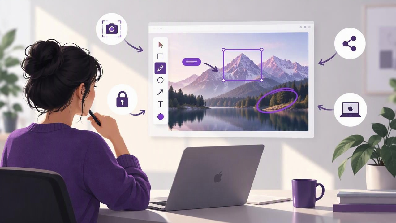
Design feedback often starts with a screenshot: a layout that feels unbalanced, a button that is hard to find, or a bug that appears only in one state. But an unmarked image can leave teammates guessing. A good screenshot annotation tool for designers makes it easy to capture the right area, add clear visual guidance, and share the result without turning a quick note into a production task.
The best choice depends less on the longest feature list and more on your daily workflow. Consider what you need to capture, which annotations make feedback understandable, where screenshots go afterward, and how much control you want over privacy and cost. This guide breaks down those decisions for designers working on Mac.
Start with the feedback you need to communicate
Before comparing apps, look at the kinds of visual comments you make most often. A designer reviewing an interface may need to point to spacing, label a component, blur customer details, or show a sequence of actions. A simple markup app can be enough for these tasks; a larger collaboration suite may be useful when feedback needs to live in a shared review process.
Think about the recipient, too. A teammate who knows the file may understand a small arrow. A client or support agent may need a short label and a clearly numbered sequence. The right annotation is the one that reduces back-and-forth—not necessarily the one with the most decorative options.
- For quick visual feedback: use one arrow, a shape, or a short text label.
- For tutorials and handoffs: number actions in the order they should happen.
- For sensitive screens: blur personal, customer, or account information before sharing.
- For bug reports: capture enough surrounding interface to show where the issue occurs.
Evaluate the capture workflow before the markup tools
Annotation quality starts with the capture. If selecting the right region takes too long, or if you repeatedly crop away useful context later, even excellent drawing tools will feel cumbersome. Check whether an app supports both region capture and full-screen capture, and whether it makes the selection process predictable.
Region capture is helpful when you want to focus attention on one panel, dialog, or control. Full-screen capture can be better for showing where an issue sits within a complete app or desktop workflow. Some design reviews benefit from both: a full view for context and a close-up for precise feedback. Look for an app that lets you choose the capture type without disrupting your work.
Also consider what happens immediately after capture. Does the image open in an editor, copy to the clipboard, save to a location you choose, or remain available for dragging into another app? A flexible handoff can save time when your destination changes from a design document to a chat, issue tracker, or email.
Choose annotations that stay readable
A practical screenshot annotation tool should make common marks quick to apply and easy to understand. Arrows direct attention. Shapes outline a region or component. Text adds a brief explanation. Blur helps conceal information that does not belong in the conversation. Numbered markers turn separate images—or several actions in one image—into a sequence.
Prioritize usability over a huge collection of effects. Check that marks are visible against both light and dark interfaces, that text can be read at the image’s actual size, and that selected items can be adjusted without starting over. If you regularly revise feedback, the ability to move or remove an annotation matters more than an elaborate style library.
Keep each image focused. Too many arrows, colors, or paragraphs can compete with the interface itself. A useful rule is to make one primary point per screenshot. If you need to explain multiple changes, split the feedback into a small set of numbered images or use concise labels beside the relevant areas.
Match the tool to a designer’s everyday use cases
Interface reviews
For a design critique, capture the relevant screen and mark the exact alignment, spacing, or hierarchy concern. Use a simple outline for a broad area and an arrow for a specific control. Write neutral, actionable notes such as “align with the field above” rather than vague reactions like “this looks off.”
Bug reports and QA
A helpful bug screenshot shows the problem and enough context to reproduce it. Include the visible state, relevant control, and—when useful—a numbered marker for the action that leads to the issue. Keep annotations separate from the facts: a short label can identify the unexpected result without covering the element being reported.
Tutorials and handoffs
For instructions, numbered steps create a visual path through a screen. Keep numbering consistent, use one marker per action, and pair the image with concise directions. If the task spans several screens, capture each stage at a similar scale so readers can follow the sequence without repeatedly reorienting themselves.
Compare screenshot apps by workflow, not popularity
Mac screenshot apps overlap, but they are not all designed around the same job. Use a short trial with your own tasks rather than relying only on feature grids. Capture a region, mark it up, copy it into your usual destination, and see how the app handles saving and sharing.
| App or category | What to assess | Potential fit |
|---|---|---|
| CleanShot X | Capture and annotation workflow, plus the value of any broader tools you would use | People seeking a wide-ranging screenshot utility |
| Shottr | How quickly its capture and markup approach fits your routine | Users comparing focused Mac screenshot workflows |
| Xnapper | Whether its presentation-oriented output suits your sharing needs | People preparing polished images for others |
| Snagit | Whether its broader capture and documentation approach is worthwhile for your work | Teams with needs beyond quick Mac markups |
| Dropshare or Monosnap | How sharing and delivery fit with your preferred storage and review process | Users who prioritize getting images to other people |
Features, plans, and platform support can change, so verify current details before choosing. A tool that is popular with another team may still be a poor fit if it adds steps to your particular workflow. Likewise, a lightweight app can be the better choice when you mainly need fast captures and clear annotations rather than a complete media or collaboration system.
Think about privacy and where screenshots go
Screenshots can contain names, email addresses, customer records, internal dashboards, or unreleased designs. Check whether an app keeps captures local by default, whether any upload happens automatically, and what controls are available for sharing. These details matter especially when you handle client work or sensitive product information.
A local-first workflow keeps captures and recent history on your Mac unless you choose to send them elsewhere. Optional cloud sharing can still be useful when collaborators need a link; the important distinction is whether sharing is a deliberate action or an automatic part of capture. If an app connects to a service such as Google Drive, review which account it uses and what is uploaded before adopting it for confidential material.
Blur is useful for reducing exposure, but treat it as one part of a privacy check—not a substitute for inspecting the final image. Confirm that sensitive text is genuinely obscured, check the edges of the blur, and look for details elsewhere in the screenshot that could identify a person or account. When appropriate, capture a cleaner screen or crop out unrelated information instead.
Consider pricing and the cost of extra complexity
Subscription software can make sense when you rely on a service’s ongoing hosting, collaboration, or frequent updates. But if your main need is local capture and annotation, recurring costs may not match the value you receive. Compare the total cost with the tasks the app actually handles, and check whether a one-time license covers the Macs you use.
Cost is not just the price on the product page. Include setup time, extra sharing steps, and features you may never use. A streamlined tool can be more economical in practice if it helps you finish routine visual feedback quickly. On the other hand, a broader app may justify its price if it replaces several tools your team already depends on.
Run a five-minute test before deciding
Use a real design or QA task to compare candidates. Capture a small region, add an arrow and text, blur a sample detail, and create a numbered step. Then copy the image into your usual app, save a copy, and test any sharing option you expect to use. Notice where the workflow feels smooth and where it asks you to make unnecessary decisions.
- Can you capture the right area without repeated attempts?
- Are arrows, shapes, text, blur, and numbered markers easy to find?
- Does the final image remain readable at its intended size?
- Can you copy, save, drag, or share it in the way your team expects?
- Are privacy defaults and pricing clear enough for regular use?
Write down the one or two features that genuinely save time. That small checklist is more useful than choosing an app based on a long list of capabilities you may not use.
Make your screenshots easier to act on
The best screenshot annotation tool for designers is the one that helps people understand what to change, where to look, and what to do next. Start with reliable region and full-screen capture, use restrained annotations, and choose a sharing method that matches the sensitivity of the image. Evaluate privacy, platform fit, and pricing alongside the editor itself.
If a local-first Mac workflow is what you need, Snip Halo is one option to consider; the same practical test applies: see whether it fits the way you capture, annotate, and hand off visual feedback.
