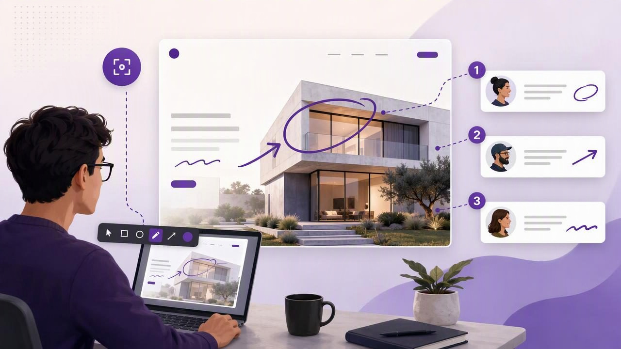
A full screen capture tool for designers is more than a way to save what is on a monitor. It is a practical communication tool for reviewing interfaces, documenting visual decisions, reporting bugs, and helping teammates understand exactly what needs attention.
Design work often involves feedback that is difficult to explain in plain text. A comment such as “the spacing feels off” or “the button is too close to the edge” can create ambiguity. Which button? Which edge? On which screen size? A well-marked screenshot removes that uncertainty by showing the problem in context.
Whether you design product interfaces, websites, mobile experiences, presentations, or marketing assets, a thoughtful screenshot workflow can reduce back-and-forth and make every review more actionable. This guide explains how to use full-screen and region capture effectively, what annotations to add, and how to choose a screenshot workflow that supports clear visual collaboration.
Why designers need more than the default screenshot shortcut
macOS includes capable screenshot shortcuts. Pressing Command + Shift + 3 captures the full display, while Command + Shift + 4 lets you select a region. Those shortcuts are useful for quick captures, but designers frequently need to do more after the image is created.
For example, a design review screenshot may need an arrow pointing to a misaligned icon, a blur over customer data, a numbered sequence showing interaction order, and a short note explaining the expected behavior. Switching among several applications to complete those tasks can interrupt focus and create inconsistent results.
A dedicated full screen capture tool helps turn a raw image into a concise visual message. The value is not simply in capturing pixels; it is in making those pixels useful to another person.
When to use full-screen capture instead of region capture
Both full-screen capture and region capture have a place in a design workflow. The right choice depends on how much context the reader needs to understand the issue.
Use full-screen capture for context-heavy feedback
A full-display screenshot is especially useful when layout, hierarchy, browser width, system UI, or surrounding content affects the decision. It preserves the broader experience rather than isolating a single component.
- Reviewing a landing page at a specific desktop breakpoint
- Showing how a modal affects the page behind it
- Documenting a workflow that spans a browser, design tool, and chat app
- Reporting an issue caused by a monitor resolution or display setting
- Capturing a dashboard where relative placement matters
For designers, context is often the difference between a useful observation and a vague opinion. The surrounding interface can reveal whether an element is truly too large, whether visual hierarchy is working, or whether a problem appears only at a certain viewport size.
Use region capture for focused, low-noise communication
Region capture works best when the issue is self-contained. It keeps file sizes manageable, protects unrelated information, and directs attention immediately to the object under review.
- Calling out a single typography inconsistency
- Sharing an icon option with a stakeholder
- Documenting a component state in a design system
- Sending a cropped example of correct versus incorrect spacing
- Creating a focused visual note for a developer
A simple rule helps: capture the smallest area that still explains the problem. Start with a region capture, then expand to full-screen capture if the reader would otherwise ask, “Where is this happening?”
The annotation tools that make design feedback actionable
Annotation is where screenshots become a real design communication asset. The most useful tools are usually simple: arrows, shapes, text, blur, and numbered markers. Each has a distinct job.
| Annotation | Best use | Design feedback example |
|---|---|---|
| Arrow | Direct attention quickly | Point to a button with incorrect padding |
| Rectangle or circle | Group or isolate an area | Highlight an entire card component |
| Text label | Add concise explanation | “Use the secondary button style here” |
| Blur | Protect sensitive information | Hide names, email addresses, or client data |
| Numbered marker | Show sequence or priority | List the order of changes in a review |
The goal is not to decorate the screenshot. It is to remove interpretation. Use one annotation type when it is enough, and combine tools only when each one adds meaning.
Use arrows for specific visual corrections
Arrows are ideal when there is one clear target. A short arrow pointing to a spacing issue is easier to scan than a paragraph describing the location. Keep arrow colors consistent across your team when possible. For example, red can indicate an issue, green can indicate approval, and a neutral color can identify an area for discussion.
Use shapes to show scope
A rectangle around an entire pricing card communicates a different scope than an arrow aimed at one line of text. Shapes are useful for establishing boundaries: “Everything inside this component needs to follow the updated token values.”
Use text sparingly
Text labels should clarify, not duplicate what is visible. Instead of writing “This icon is not aligned with the text,” use a brief label such as Align to text baseline. The screenshot already supplies the visual evidence; the text should communicate the desired outcome.
Use blur before sharing externally
Designers regularly work with staging environments, analytics dashboards, customer records, internal roadmaps, and confidential prototypes. Before sharing a screenshot, blur personal data, API keys, private URLs, account balances, or unreleased product details. A local-first screenshot workflow is particularly useful when privacy matters because images can remain on the Mac unless you deliberately choose to share them.
A repeatable screenshot workflow for design reviews
Consistency makes visual feedback easier to create and easier to consume. Use this simple process for design critiques, QA sessions, and stakeholder reviews.
- Set the right view. Open the relevant screen, breakpoint, browser zoom level, or app state. Remove distracting windows if they do not add context.
- Choose full-screen or region capture. Preserve the context needed to understand the feedback, but avoid capturing unrelated content.
- Mark the evidence first. Add an arrow, shape, or numbered marker directly over the relevant area.
- Add the requested action. Use a short label that tells the reader what should change, not merely what is wrong.
- Blur sensitive content. Check browser tabs, user data, notifications, and background windows before sharing.
- Use a clear filename. Include the feature, screen, issue, and state, such as
checkout-mobile-error-message-spacing.png. - Share through the appropriate channel. Copy the image into a task, drag it into chat, attach it to a ticket, or use an approved cloud-sharing option.
This workflow takes seconds after it becomes a habit, yet it can prevent long conversations based on incomplete descriptions.
How to write useful screenshot feedback
Even the best full-screen capture tool cannot compensate for unclear feedback. Pair your screenshot with a short statement that gives the recipient enough direction to act.
Weak: “This looks weird.”
Better: “At the desktop breakpoint, increase the gap between the heading and CTA to match the spacing used in the feature section.”
A reliable feedback format is:
Location: Pricing page, desktop
Issue: CTA is too close to the card title
Expected: Apply the 24 px vertical spacing token
Priority: Before stakeholder review
The screenshot shows where; the note explains what to change and why it matters. This combination is valuable for developers, product managers, fellow designers, and external clients.
Common screenshot mistakes designers should avoid
Visual feedback becomes less useful when screenshots create more questions than answers. Watch for these common issues.
- Capturing without context: A tight crop can hide the layout relationship causing the problem.
- Using too many arrows: Multiple arrows competing on one image make prioritization unclear.
- Writing long paragraphs on the image: Put detailed rationale in the task or message, not over the interface.
- Forgetting the viewport: Responsive issues should include enough browser or screen context to identify the breakpoint.
- Sharing sensitive details: Blur private data before pasting images into a public channel or external ticket.
- Mixing approved and requested changes: Use labels or colors consistently so recipients know what is final versus exploratory.
Choosing a full screen capture tool for designers
When evaluating a screenshot app, focus on the workflow rather than an oversized feature list. Designers generally benefit most from fast capture, immediate annotation, clean export options, and a sharing model that matches their privacy requirements.
Look for these practical capabilities:
- Fast full-display and region capture with reliable keyboard shortcuts
- Arrows, shapes, text, blur, and numbered step markers
- Easy copy, save, and drag-and-drop actions
- Local screenshot history for revisiting recent captures
- Optional sharing rather than automatic uploads
- Clear image quality controls for design details and text
- A pricing model that fits the team’s long-term needs
Some teams need scrolling capture, recording, or broader asset-sharing features. Others prefer a focused app that handles static screenshots quickly and keeps routine captures local. The best choice is the one that lets you move from “I found an issue” to “the right person understands it” with the fewest steps.
Make screenshots part of your design system process
Screenshots are also useful beyond individual reviews. Build a small reference library of annotated examples for recurring standards: button spacing, error states, empty states, accessibility treatments, responsive behavior, and content hierarchy. These examples can support onboarding and reduce repeated explanations.
For instance, a component guideline can include a full-screen capture that shows the component in page context, followed by cropped region captures for exact states. Numbered markers can identify the rules in reading order. Over time, this creates a visual companion to written documentation.
Clear captures lead to clearer design decisions
A strong screenshot workflow helps designers communicate with accuracy, speed, and confidence. Full-screen captures preserve context, region captures reduce noise, and simple annotations turn observations into clear next steps. Used well, screenshots reduce review cycles and make feedback more useful for everyone involved.
If you want a focused Mac workflow for capture, annotation, local history, and optional sharing, Snip Halo is one example of a lightweight tool built around those everyday visual communication tasks.
