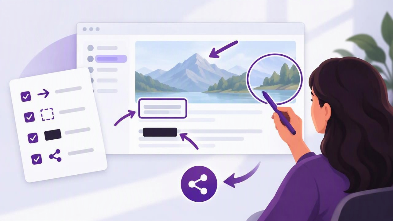
A well-placed arrow can make a screenshot easier to understand in seconds. It can point a teammate to a bug, show a customer which button to select, or guide a reader through a tutorial. But arrows only help when they are clear, accurate, and supported by the right context. Too many, or arrows aimed at the wrong detail, can make an image more confusing than the interface itself.
This checklist explains how to add arrows to a screenshot with a screenshot annotation tool, from choosing a useful capture to checking the finished image. Use it for bug reports, support replies, product feedback, and step-by-step instructions on Mac.
Why arrows work—and when they do not
An arrow creates a visual path between the explanation and the item being discussed. That reduces the effort needed to search a busy screen. It is particularly useful for pointing out a small control, a changed value, or the location of an unexpected message. A shape can outline an area, while text can explain what the arrow means; together, these annotations help viewers understand both where to look and what they are seeing.
An arrow is less useful when the target is already obvious or when it covers important content. If a screenshot needs several arrows to explain one point, consider cropping closer, splitting the explanation into numbered steps, or capturing a cleaner screen. The goal is not to decorate the image. It is to make the next action or observation unmistakable.
Screenshot annotation checklist: before you draw
- Choose the right capture. Use a region capture when one panel, dialog, or control is the focus. Choose a full-screen capture when the issue depends on surrounding context, such as a menu appearing in the wrong place or a layout problem across windows. A tighter image usually needs fewer annotations, but do not crop away details a reader needs to interpret the issue.
- Remove distractions first. Close unrelated menus, move the pointer away from the target, and dismiss notifications when practical. If the screen contains many competing elements, consider whether you can reproduce the issue in a simpler state. A clean capture gives your arrows room to work and makes the important detail easier to spot.
- Check the image at its intended size. An arrow that looks clear while zoomed in may become tiny when pasted into a ticket or email. Before annotating, consider where the image will appear: a support portal, a chat message, a document, or a slide. Keep critical details and annotation labels readable at that size.
- Decide on one message. Write down the point the screenshot needs to communicate, such as “Select Export” or “This total does not match the report.” If the image is trying to explain several unrelated things, split it into separate captures. A focused visual is easier to scan and easier to discuss.
How to add arrows to a screenshot with a screenshot annotation tool
- Mark the exact target. Place the arrowhead near the control or detail, not somewhere in the general area. Aim at a button edge, error line, field, or other precise landmark. Leave enough space around the target that the arrowhead does not obscure text or make a small icon difficult to see.
- Choose a direction that reads naturally. Draw from open space toward the target so the arrow leads the eye rather than crossing the point of interest. A short diagonal or horizontal line is often easier to follow than a long path that runs through unrelated content. If an arrow must cross something important, try repositioning it or cropping the image differently.
- Use a visible, consistent style. Select a color that contrasts with the background and remains distinct from interface elements. Use a line weight that is visible without overpowering the screenshot. If several arrows appear in one image, keep their color, thickness, and arrowhead style consistent unless color has a clear meaning, such as separating two options.
- Add a short label when the arrow is ambiguous. An arrow can show where to look, but it may not explain why. A concise note such as “Unexpected value” or “Open this menu” supplies the missing context. Place text in open space, keep it brief, and make sure it does not compete with the target. Avoid repeating information already obvious from the image.
- Use shapes for areas, arrows for direction. A rectangle or outline is often better for emphasizing a broad region, while an arrow works well for a specific point or action. You can combine them, but use each annotation for a distinct purpose. For example, outline a settings panel and use one arrow to identify the exact toggle inside it.
- Number sequences in order. For tutorials or multi-step feedback, numbered markers can make the reading path explicit. Place markers near each relevant control and ensure the numbers follow the order of action. If the sequence is complex, pair each marker with a short instruction or divide the process across multiple screenshots rather than crowding every step into one frame.
- Blur sensitive information. Before sharing, inspect the entire capture for names, email addresses, account details, private messages, access tokens, or customer data. Use a blur or redaction feature where appropriate, and check that the covered area is actually unreadable in the exported image. Cropping can remove irrelevant private details, but it does not replace careful review of what remains.
- Review the finished image. Check that each arrow points to the intended item, text is legible, and annotations do not conceal key content. Then view the screenshot at normal display size. If the message is still unclear, simplify it before sharing. A short explanation in the accompanying message can resolve context that does not belong on the image.
A practical workflow for common use cases
Bug reports
For a bug report, capture the visible problem and enough of the interface to establish where it occurred. Add one arrow to the incorrect result, then use a short label to describe what should have happened. Include relevant details in the ticket itself—such as the steps to reproduce, app version, and expected behavior—rather than trying to squeeze them all onto the screenshot. Keep private account or customer data out of the image.
Tutorials and support instructions
For instructions, use a sequence that follows the same order as the written steps. A separate image for each major stage can be clearer than one crowded overview. If one screenshot is sufficient, numbered markers can show the order: first open a menu, then select an option, then confirm the result. Make sure each marker is close to its target and that the explanatory text uses the same names as the interface.
Visual feedback
When commenting on a design or document, distinguish observations from suggestions. An arrow can identify the element, while a nearby note can say “Increase spacing” or “Check contrast.” Avoid drawing over the feature you want reviewed. If a comparison is useful, capture both relevant states or describe the difference clearly so the recipient does not have to guess what changed.
Common arrow annotation mistakes to avoid
- Over-annotating: Multiple arrows, circles, labels, and boxes can compete for attention. Keep only the marks needed to support the main message.
- Pointing vaguely: An arrow aimed at a whole panel may leave the reader wondering which control matters. Move the tip closer to the precise target.
- Hiding interface details: Do not cover a label, error message, or button with the arrowhead or annotation text. Reposition the mark or use a nearby label.
- Using color as the only signal: Color may be difficult for some viewers to distinguish and can shift across displays. Pair it with direction, labels, or numbered markers.
- Sharing without a privacy check: An annotated image can still reveal sensitive details outside the marked area. Inspect the full capture before sending or uploading it.
Choosing a screenshot annotation tool
A useful screenshot annotation tool should fit the whole workflow, not just drawing arrows. Look for reliable region and full-screen capture, straightforward controls for arrows and shapes, text labels, blur, and numbered markers if you create instructions. Also consider how you will move the image into its destination: copying to the clipboard, saving a file, or dragging it into another app may each be useful in different situations.
Privacy and sharing are part of that decision. Some people prefer captures and recent history to remain local by default, with any cloud sharing initiated deliberately. Others need a connected workflow for teams. Check where images are stored, whether uploads happen automatically, and which account or service receives a shared link. For occasional personal use, a one-time license may be preferable to a recurring subscription; for a team, collaboration needs may matter more than the payment model.
Do not choose by feature count alone. A compact Mac screenshot app may suit quick bug reports, while a larger tool may be a better fit for recording, advanced editing, or team review. Compare how quickly you can capture, annotate, and deliver one real example from your work. That practical test often reveals more than a long feature list.
Final pre-share checklist
- Does the capture show the right amount of context?
- Does every arrow point to one specific detail?
- Are labels concise and readable at normal size?
- Are steps numbered in the correct order?
- Have sensitive details been removed or obscured?
- Does the final image make sense without a spoken explanation?
Clear screenshot annotation is a small skill with an outsized effect: it can shorten a bug report, make a tutorial easier to follow, and help feedback feel actionable. Capture only what the reader needs, draw with intention, and review the image before sharing. For Mac users looking for a focused local-first workflow with optional Google Drive sharing, Snip Halo is one example to consider alongside other screenshot tools.
