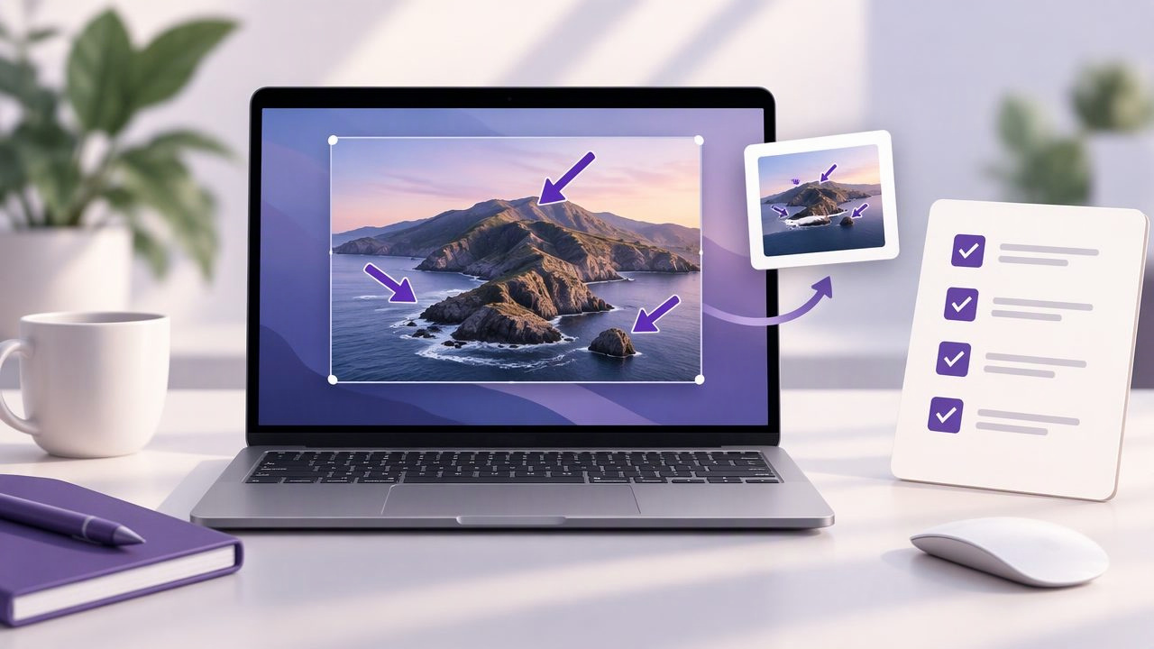
A screenshot can show exactly what is on your screen, but it cannot always explain what someone should notice or do next. A well-placed arrow adds that missing direction. Pair it with a floating screenshot preview, and you can annotate, check your work, and share the image without losing your place in the task.
This guide walks through a practical Mac screenshot checklist: capture the right area, add arrows that point clearly, use labels or numbered steps when needed, and review the result before sending. It works for bug reports, tutorials, design feedback, and everyday support messages.
Why add arrows to a screenshot?
Arrows make visual communication faster by directing attention to a specific control, error, or change. Instead of writing, “Look near the top-right corner, beside the search field,” you can point directly at the button. This is especially useful when the recipient is unfamiliar with the screen or when several elements look similar.
Arrows are most effective when they support a clear message, not when they decorate the image. One arrow can clarify a single issue. A short sequence of arrows can guide someone through a process. Too many, however, can make a screenshot feel like a maze. The goal is to reduce the time it takes to understand what matters.
Start with the right capture
Before annotating, decide what the screenshot needs to communicate. A region capture is usually best when the important detail is a dialog, form, error message, or small part of a page. It keeps attention on the relevant area and makes the final image easier to scan. Use a full-screen capture when context matters, such as showing where a setting lives in an app or how a window relates to the desktop.
Check that the target is visible and in the state you want to explain. Close unrelated menus, move the pointer away from important text, and wait for loading or animations to finish. If you are documenting a bug, capture the actual error and enough surrounding interface to help someone identify where it occurred. A useful screenshot shows the problem without making the viewer guess what they are looking at.
Checklist: add arrows to a screenshot clearly
- Choose one main point. Decide what the viewer should notice first. If the image contains several separate issues, consider making separate screenshots instead of crowding one.
- Place the arrowhead precisely. Aim at the exact control, message, or location. Avoid pointing vaguely at a large panel when a particular button is the issue.
- Keep the arrow readable. Use a color and line weight that stand out against the background. Make sure the arrow is large enough to see but does not cover the detail it identifies.
- Use a simple direction. A short diagonal or horizontal arrow is usually easier to follow than one that crosses the whole image. Keep its path clear of other important content.
- Check for ambiguity. If an arrow could point to two nearby items, adjust its endpoint or add a brief text label.
- Review at normal size. Zoom out to the size the recipient is likely to see. Confirm that the target remains visible and the annotation is not overpowering.
This sequence works whether you are adding one arrow to a quick support reply or preparing a polished visual instruction. If the screenshot still needs a paragraph to explain what the arrow means, add a concise label or revise the capture.
Use a floating screenshot preview to keep your workflow moving
A floating screenshot preview is a small, temporary view of a capture that stays available while you work. On Mac, the built-in screenshot interface can show a thumbnail after capture; some screenshot apps also provide a preview or editing window. These are related but not identical experiences, so check what your chosen workflow offers. The useful idea is having the capture close at hand while you decide whether to annotate, copy, save, or discard it.
With a preview visible, you can quickly check whether the capture includes the right details before sending it. If something is missing, retake it while the original screen is still open. If it is correct, add arrows and other marks without hunting through a folder. This can reduce interruptions during a support conversation, design review, or tutorial-writing session.
A simple sequence is: capture, inspect the preview, annotate, review, then copy or save. When you need to refer to the original screen again, a floating preview can also help you compare the marked-up image with the interface. Avoid leaving sensitive content visible longer than necessary, particularly when sharing your screen or working in a public setting.
When to combine arrows with other annotations
An arrow is a strong directional cue, but different annotation tools solve different problems. Add a shape around a region when the entire area matters. Use text for a short explanation, such as “Select this option” or “Unexpected result.” Blur private details such as email addresses or account numbers before sharing. These marks should make the image more understandable while preserving the context needed to act.
For tutorials and multi-step instructions, numbered step markers can make the order explicit. Place a number beside each action and keep the order consistent with the written directions. For example, mark the settings menu as 1, the relevant option as 2, and the confirmation button as 3. If the steps involve several screens, use a separate screenshot for each stage rather than forcing a long process into one crowded image.
A reusable screenshot checklist for common tasks
For a bug report
- Capture the error and enough interface context to identify the feature.
- Add an arrow to the unexpected behavior or error message.
- Use a short text label if the issue is not self-explanatory.
- Blur credentials or personal information before sharing.
For a tutorial
- Capture a clean screen with the relevant control visible.
- Use numbered markers to show action order.
- Keep arrows consistent in color, style, and direction.
- Check that each instruction matches the image it describes.
For design or client feedback
- Capture the correct version and include surrounding context where useful.
- Point to the precise element that needs attention.
- Separate unrelated comments into distinct annotations or images.
- Use a neutral label that describes the requested change clearly.
Common arrow annotation mistakes
Pointing near the target rather than at it: A broad arrow can leave the viewer unsure which control you mean. Move the arrowhead closer, or add a circle to narrow the focus.
Covering the evidence: An arrow that hides a small icon or part of an error message defeats its purpose. Try approaching from an open area or using a shorter line.
Using too many colors: A consistent visual style feels easier to follow. Reserve extra colors for different meanings, and explain those meanings if the distinction is not obvious.
Forgetting privacy: Screenshots can contain names, notifications, account details, or customer data. Inspect the full image, not just the area under the arrow, and blur anything the recipient does not need to see.
Sharing without a final review: Check the image at its actual viewing size. Confirm the arrow points to the intended target, the text is legible, and the saved or copied file is the annotated version.
Copy, save, or share the finished screenshot
Choose the delivery method that fits the conversation. Copying an image is convenient for a chat or email reply. Saving creates a file for documentation, a bug tracker, or a tutorial archive. If you share through cloud storage, verify the destination and access permissions before sending a link. A link that is private to you will not help a colleague; a link with overly broad access may expose more than intended.
Consider where your screenshot app stores captures and whether it uploads them automatically. For sensitive work, a local-first workflow can be useful: captures and recent history remain on the Mac unless you choose to share them. Optional cloud sharing gives you flexibility, while keeping the decision to upload in your hands. Always check an app’s privacy and storage behavior rather than assuming all screenshot tools work the same way.
Make the checklist part of your routine
Clear screenshot annotations depend less on elaborate editing than on a repeatable process. Capture only what is needed, point to the exact detail, add a label or number when it improves understanding, and inspect the result before sharing. A floating preview helps keep those decisions close to the moment of capture, making it easier to retake a weak image before the workflow moves on.
When evaluating Mac screenshot apps, compare capture options, annotation tools, preview behavior, sharing choices, privacy defaults, and pricing. Some workflows call for a broad set of editing or team features; others need fast region capture, arrows, shapes, text, blur, and numbered steps without a recurring plan. Snip Halo is one Mac option designed around local capture and annotation, with optional Google Drive sharing and a one-time license.
